Design of the logo for the RFID card company "Frequency"
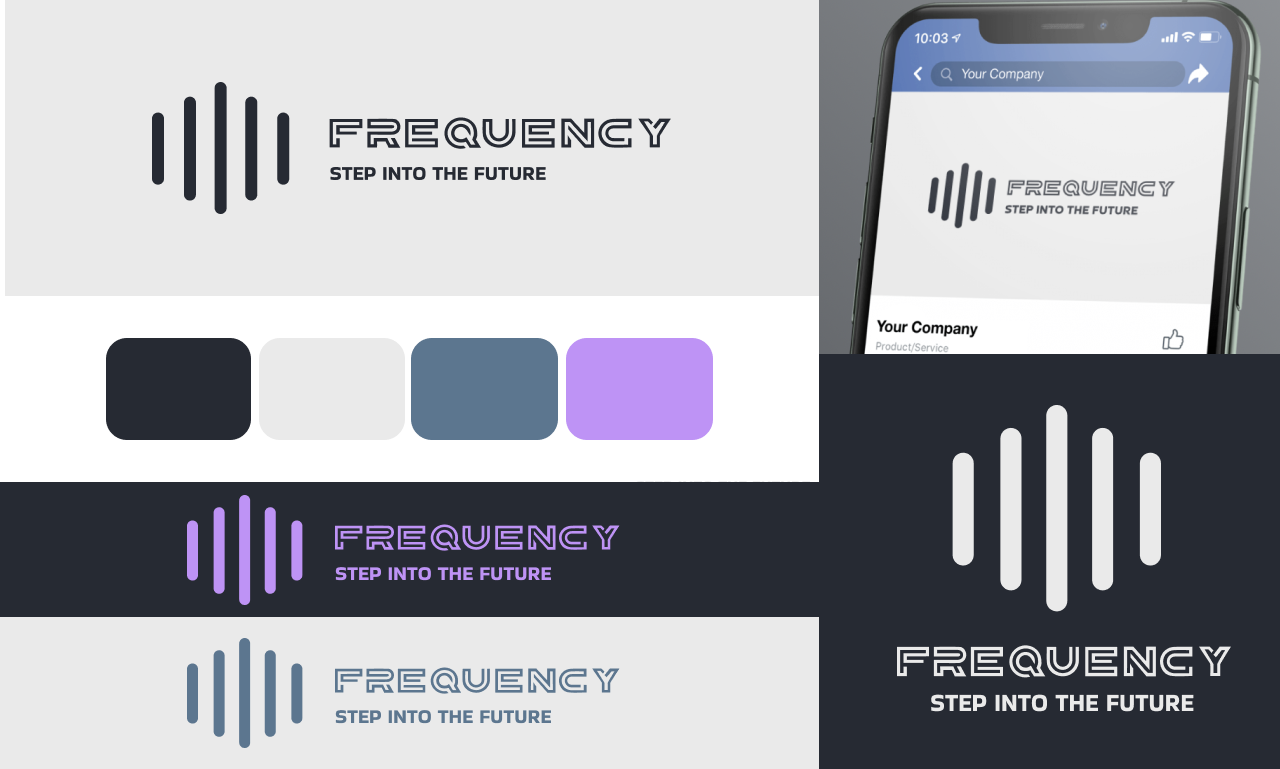
For the #Frequency company that specializes in RFID cards, I was commissioned to create a #logotype that would transmit the company’s technological expertise while establishing a sense of confidence and reliability among their customers. Inspired by the concept of frequency and combination, I have developed a #style and modern logo that contains a stylized image of radiohvils. Clear lines and minimalist design reflect the company’s commitment to innovation, while a brave font adds a note of professionalism. The color palette of blue and violet colours transmits a sense of stability and reliability, further enhancing the attractiveness of the logo for potential customers in the technology sector.
For the #Frequency company that specializes in RFID cards, I was commissioned to create a #logotype that would transmit the company’s technological expertise while establishing a sense of confidence and reliability among their customers. Inspired by the concept of frequency and combination, I have developed a #style and modern logo that contains a stylized image of radiohvils. Clear lines and minimalist design reflect the company’s commitment to innovation, while a brave font adds a note of professionalism. The color palette of blue and violet colours transmits a sense of stability and reliability, further enhancing the attractiveness of the logo for potential customers in the technology sector.