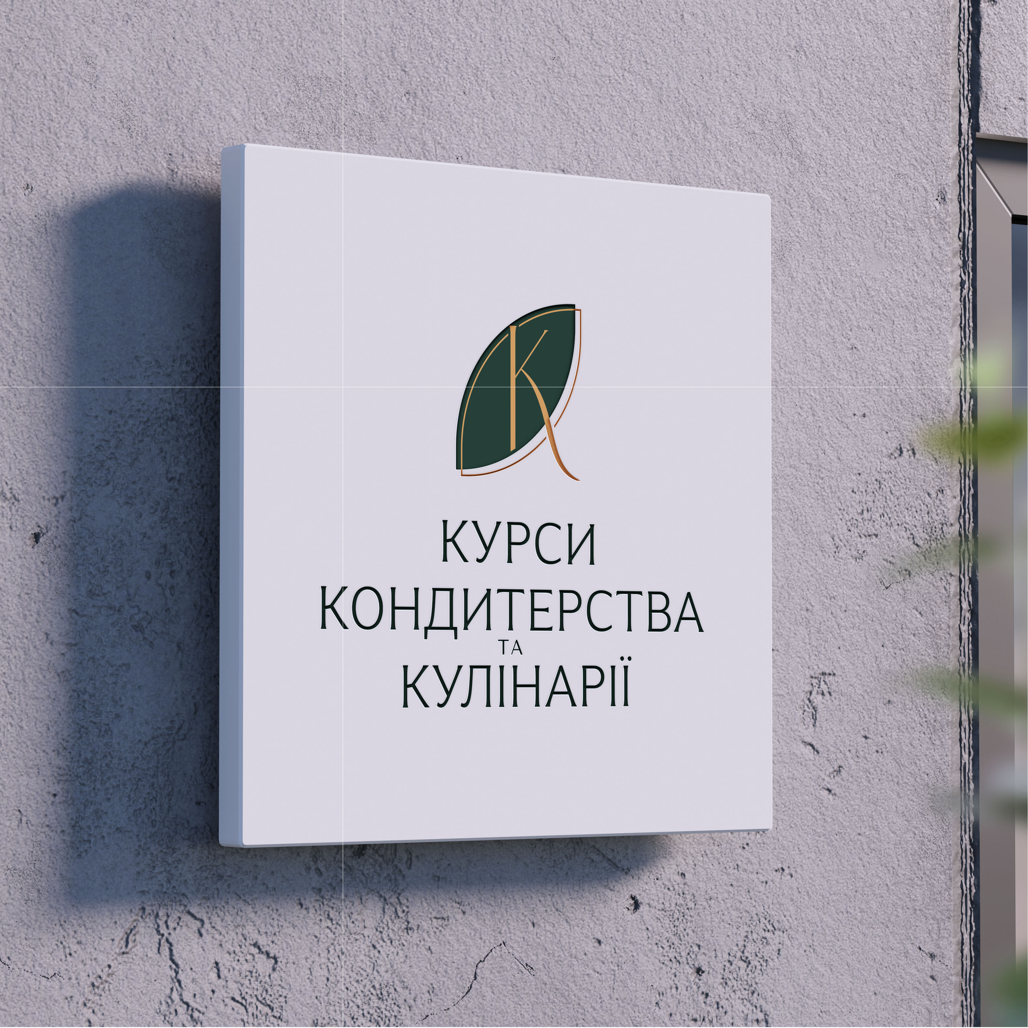
A re-design of the existing logo of the brand of the culinary school "Course of cooking and cooking" has been developed.
When working with the logo, the name of the brand and the consistency of the words in it should be preserved, and the general concept of the style of the logo should also be preserved.
At the same time, it is proposed to use brand colors that are inherent in another direction of the brand - caviar-keitering. These colors are border, smaragd, white and black.
These conditions of the project will help at the same time and keep the brand awareness among permanent users. Distance from the competitors.
The project developed an updated design of the logo in two brand colors. It is also proposed to visualize the change in the color range of the existing logo.