Logotype for the supplier of the company FRY.
Logo Design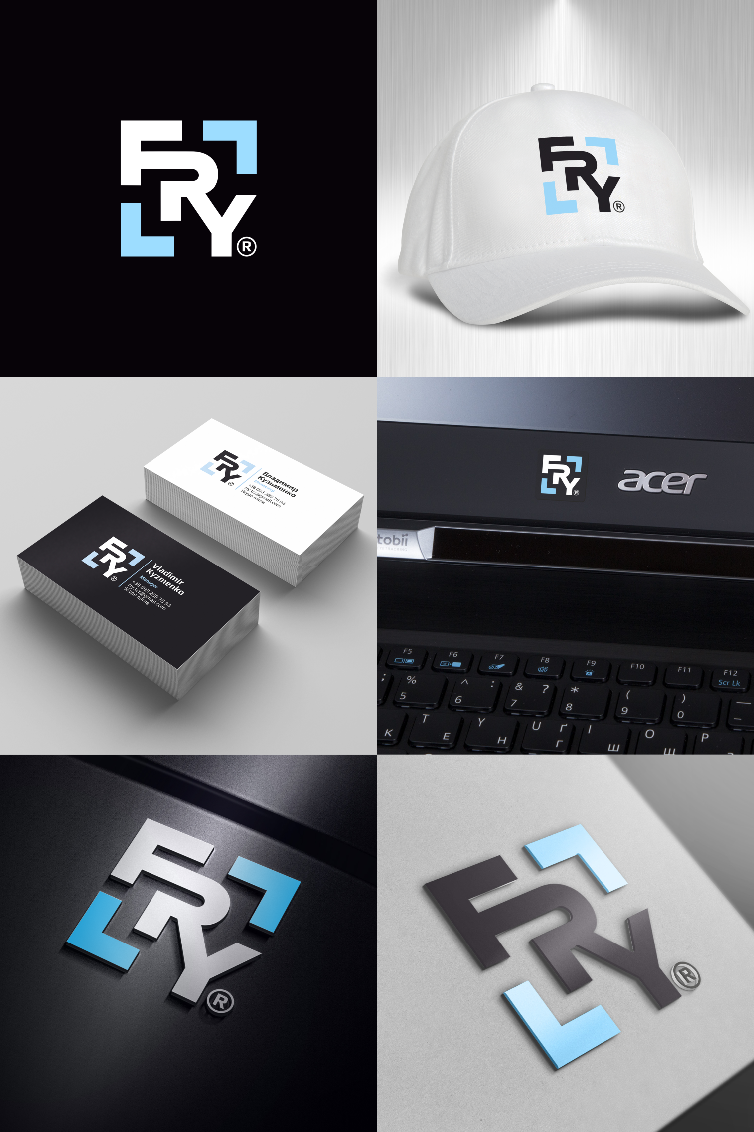
The company is a major supplier of computers and orchtechnics, the winner of numerous tender. The purpose of creating the logo is to strengthen image and recognition. The logo is also planned to stick on the post.technic.
The idea of the logo is in the stylish writing of the name, so that it is obtained in a blue frame or focus of attention. The blue shells also symbolize expansion and growth.
More about this project here: https://www.instagram.com/p/B_90RovgtGG/?img_index=7
The idea of the logo is in the stylish writing of the name, so that it is obtained in a blue frame or focus of attention. The blue shells also symbolize expansion and growth.
More about this project here: https://www.instagram.com/p/B_90RovgtGG/?img_index=7