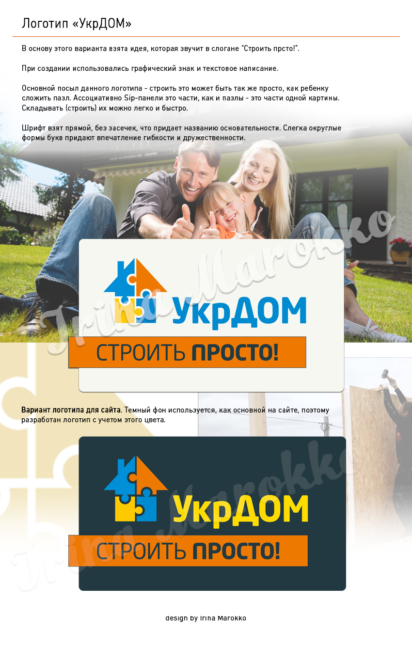
Based on this option, the idea is taken, which sounds in the slogan "Build your finger!“”
The graphic sign and text writing were used.
The main message of this logo - to build this can be as simple as the child will make a puzzle. Associatively, the Sip panels are parts, and the puzzles are parts of one picture. They can be made easily and quickly.
The font is taken straight, without seats, which gives the name to the fundamentality. The light round forms of the letters give an impression of flexibility and friendship.
The ZY. (The customer was offered 4 options of the logo. This was chosen by the majority of employees of the company.
LOGOTYPS