Lotta Premium Flower
Packaging and label design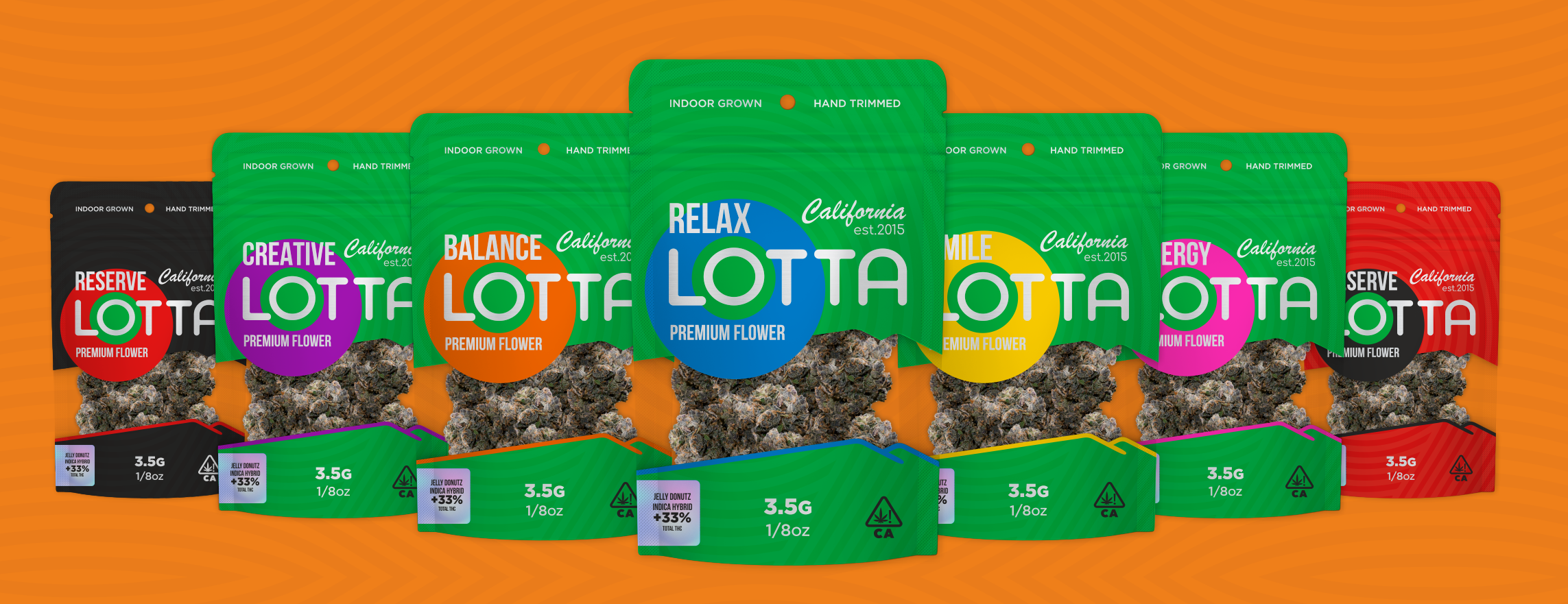
Lotta Premium Flower
Sporty-style packaging for California cannabis brand
Client: Lotta (California, est. 2015)
Category: Packaging Design / Branding
Format: Doypack 3.5 g (1/8 oz)
Product type: Indoor grown / Hand trimmed premium flower
Lotta is a brand that positions cannabis not as an escape from reality, but as part of an active, balanced life.
The design of the series reflects energy, purity, and control — properties that are closer to the sports or wellness world than to traditional cannabis "street culture."
The goal is to create a fresh alternative in a market dominated by dark or psychedelic solutions.
Lotta becomes a brand for those seeking balance, inspiration, and positive energy, rather than "extremes."
Each strain is associated with a specific state — Relax, Balance, Creative, Energy, Smile, Reserve — transforming the line into a system of emotions.
Logo: clean geometric font with soft shapes, center of composition.
Circle: a key element that encodes each state through color — from purple Creative to black Reserve.
Background: concentric waves creating an effect of movement, pulse, breathing.
Typography: modern grotesque + handwritten element California est.2015 for balance between technology and humanity.
Transparent window: allows seeing the product while maintaining a clean visual geometry.
The foundation of the visual language is a rich green background symbolizing naturalness, strength, and pure energy.
Each variety has its own accent color that conveys the user's emotional state:
Creative — purple, associated with focus and inspiration.
Balance — orange, symbol of stability and comfort.
Relax — blue, conveys calmness and clarity.
Smile — yellow, radiates lightness and optimism.
Energy — pink, embodies movement and motivation.
Reserve — black, emphasizes elitism and strength.
The combination of green with bright circles forms its own color "energy" of the brand, distinguishing Lotta among competitors and creating a cohesive palette for product line expansion.
The packaging is inspired by a sporty aesthetic — clean lines, rhythmic shapes, contrasting colors.
This is a conscious choice in favor of an active lifestyle, which is currently absent among competitors in the cannabis category.
The brand is positioned as "Active Cannabis" — for those seeking harmony between body, mind, and relaxation.
Task
Create a recognizable, color-logical system for the entire line.
Abandon visual clichés of "420" culture.
Convey a modern philosophy of wellness and sports.
Maintain a balance between the energy of colors and the purity of forms.
Result
Lotta Premium Flower is a fresh, dynamic, and confident visual style.
It stands out among competitors, shapes positive perception of the product, and opens up opportunities for scaling — to new strains, formats, and communication channels (digital, retail, outdoor).
#packagingdesign #branding #cannabisdesign #sportsstyle
#wellnessbrand #graphicdesign #colorbranding #californiabrand