MARK Craft Spirit
Packaging and label design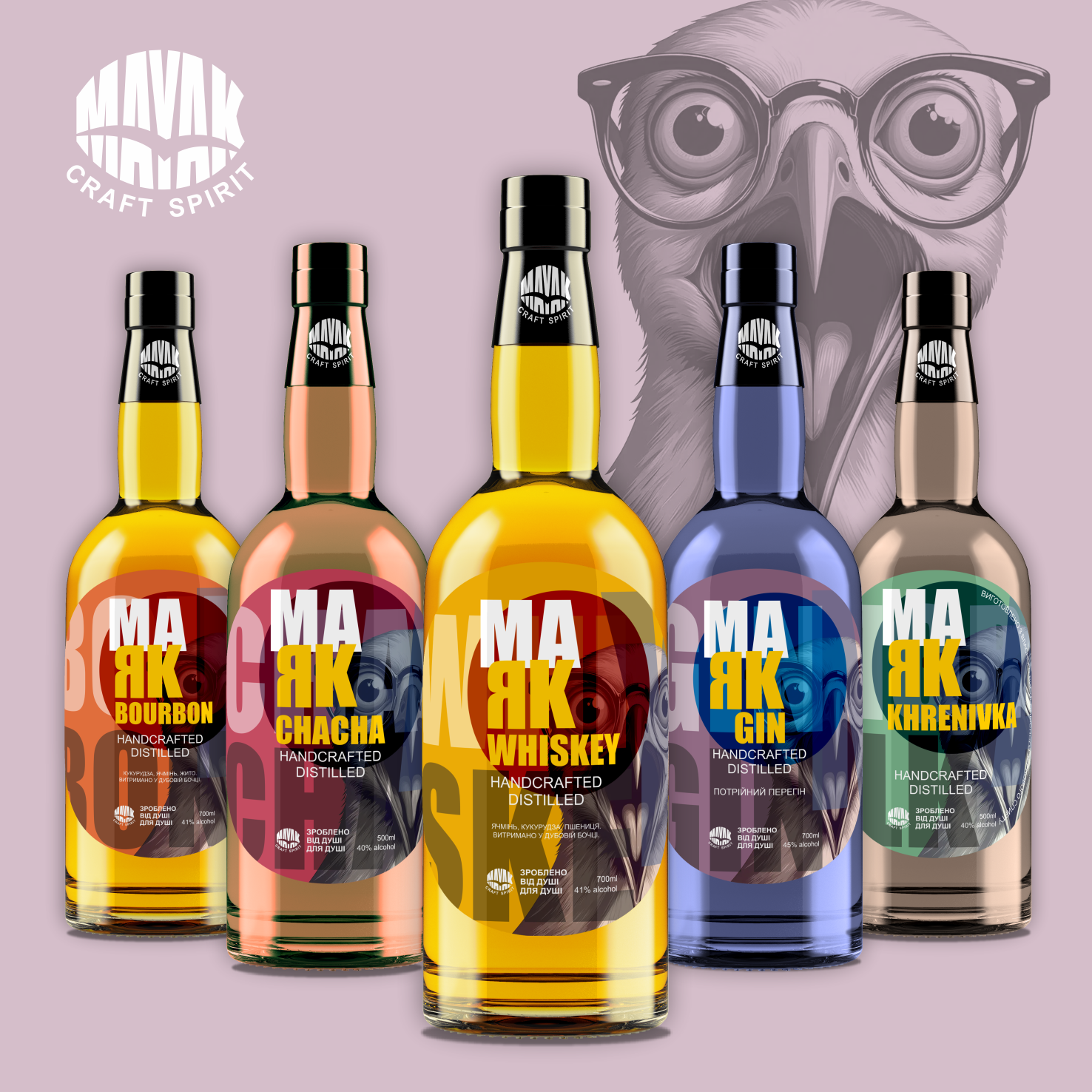
The NAME LIGHT — a multi-level wordplay:
Firstly, a lighthouse — as a symbol of a landmark, a bright presence in a sea of similar alcoholic products.
Secondly, dividing the name into MA and YAK opens up space for play with flavors: MA YAK WHISKEY, MA YAK CHACHA, MA YAK GIN, etc. Such a structure is not only easy to remember but also provides endless opportunities for expanding the product line.
The visual symbol of the brand became an expressive seagull — not accidentally, because a lighthouse without a seagull is like a party without alcohol. The bird here is a metaphor for freedom, wildness, excessive attention, and loud statements (especially after the third).
Graphic typography: the font structure of the name works as a visual hook — a large contrasting “MA” and “YAK” form the center of the composition.
Color segments: each flavor has its own color dominant — from wine red to mustard yellow. This ensures quick recognition on the shelf.
Large abstract text in the background (B, C, W, etc.) — a visual index that adds depth and creates a sense of linearity in the series.
The MAVAK logo in the form of a lighthouse beam — concise but strong brand marker.
A unique brand character has been created, combining irony, style, and recognizability.
The product line looks cohesive, but each product has its own individuality.
The ready-made design is successfully used for marketing needs and brand communications.