Final logo for an app that transforms language learning into an easy, playful adventure without textbooks, exercises, or stress.
Concept:
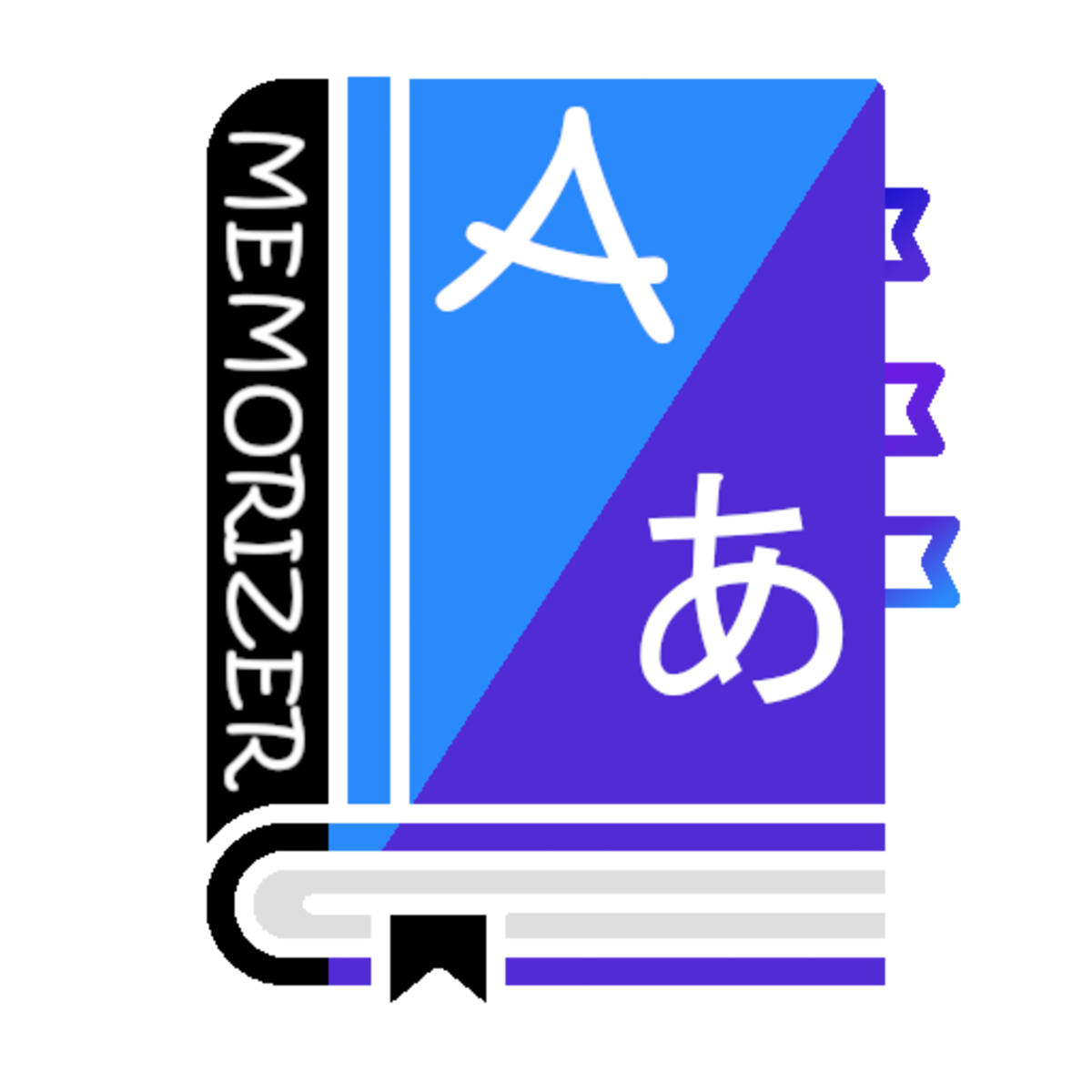
The icon embodies the idea of intuitive, unobtrusive learning through the image of a book — a symbol of knowledge, adapted to the modern user.
• The blue part with the letter “A” — embodies the Latin alphabet, logic, and structure.
• The purple part with the hiragana “あ” — a visual bridge to easy immersion in any language — through play, repetition, and cultural openness.
Hint on gamification:
Three colored bookmarks — not just a decorative element, but a hint at an internal system of progress, levels, and personalized categories.
Horizontal lines at the bottom — a stylized reminder of the “shelf of knowledge” that the user gradually fills effortlessly.
Learning philosophy:
MEMORIZER does not require textbooks or complex exercises.
The secret lies in the repetitive intervals that automatically adapt to the user's pace.
As a result, knowledge is formed naturally, as part of the game — easily, fun, and effectively.
Visual adaptability:
• Clear graphics that maintain readability on any screen.
• A contrasting palette that makes the app stand out among competitors.
• A balance between symbolism and functionality — the icon works as a brand, as a navigation element, and as an emotional trigger.
Result:
This option was chosen by the client as the most versatile, modern, and profound — it not only represents the app but conveys its value, ease, and unique approach to learning.
Concept:
The icon embodies the idea of intuitive, unobtrusive learning through the image of a book — a symbol of knowledge, adapted to the modern user.
• The blue part with the letter “A” — embodies the Latin alphabet, logic, and structure.
• The purple part with the hiragana “あ” — a visual bridge to easy immersion in any language — through play, repetition, and cultural openness.
Hint on gamification:
Three colored bookmarks — not just a decorative element, but a hint at an internal system of progress, levels, and personalized categories.
Horizontal lines at the bottom — a stylized reminder of the “shelf of knowledge” that the user gradually fills effortlessly.
Learning philosophy:
MEMORIZER does not require textbooks or complex exercises.
The secret lies in the repetitive intervals that automatically adapt to the user's pace.
As a result, knowledge is formed naturally, as part of the game — easily, fun, and effectively.
Visual adaptability:
• Clear graphics that maintain readability on any screen.
• A contrasting palette that makes the app stand out among competitors.
• A balance between symbolism and functionality — the icon works as a brand, as a navigation element, and as an emotional trigger.
Result:
This option was chosen by the client as the most versatile, modern, and profound — it not only represents the app but conveys its value, ease, and unique approach to learning.