Mercadona — Mobile App UX Audit & Concept
Interface Design (UI/UX)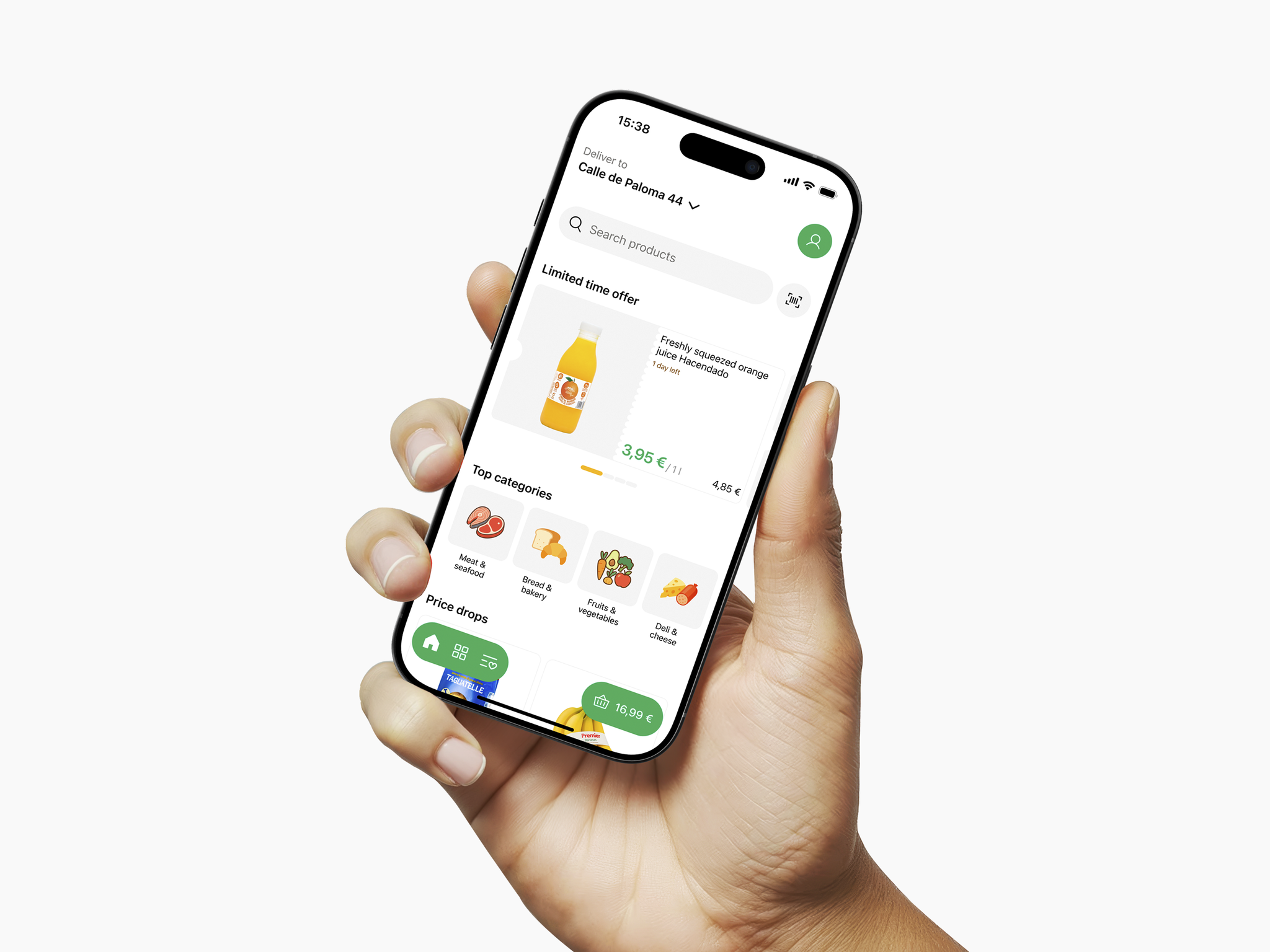
On a trip to Spain I used the Mercadona app as a customer and noticed friction in navigation and product discovery. I ran a UX audit and turned insights into improvements: clearer delivery context, category sub navigation chips, discount filters, and enriched product pages with nutritional info. The focus was on reducing user effort and boosting conversions while combining real customer perspective with product design thinking.
Want your app to be effortless and conversion driven? Let’s collaborate!
Want your app to be effortless and conversion driven? Let’s collaborate!