The task was to create a recognizable symbol without text that is equally well perceived both as a 16×16 favicon and on a billboard, not tied to the genre of a specific game and works in both digital environments and print publications.
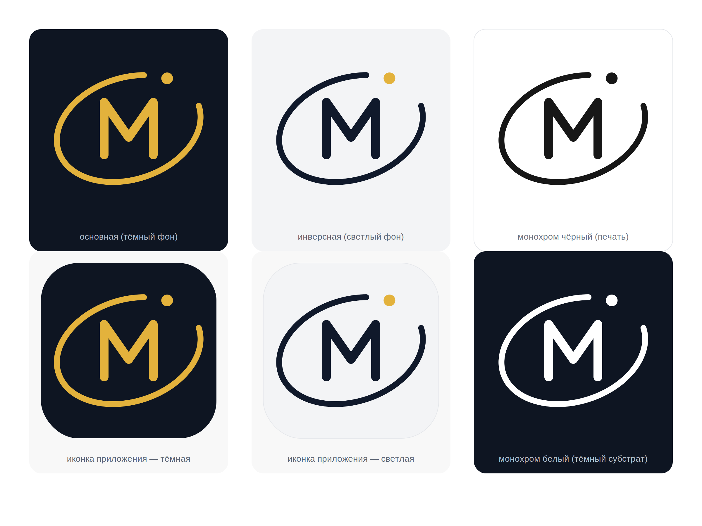
The key idea is to play on the studio's name through the image of the planet Mercury: the monogram "M" is inscribed in an open orbit, the gap in the ring creates a sense of movement, and the accent point at its end is perceived as a planet moving away. The flat vector geometry and close line thicknesses make the sign strict and modern rather than decorative.
The palette—a deep dark blue cosmos with a golden accent—works in both neon digital environments and in print.
Deliverables: main, inverse, and monochrome versions of the sign, a set of app icons, favicon, PNGs of all sizes, and SVG source files.
The key idea is to play on the studio's name through the image of the planet Mercury: the monogram "M" is inscribed in an open orbit, the gap in the ring creates a sense of movement, and the accent point at its end is perceived as a planet moving away. The flat vector geometry and close line thicknesses make the sign strict and modern rather than decorative.
The palette—a deep dark blue cosmos with a golden accent—works in both neon digital environments and in print.
Deliverables: main, inverse, and monochrome versions of the sign, a set of app icons, favicon, PNGs of all sizes, and SVG source files.