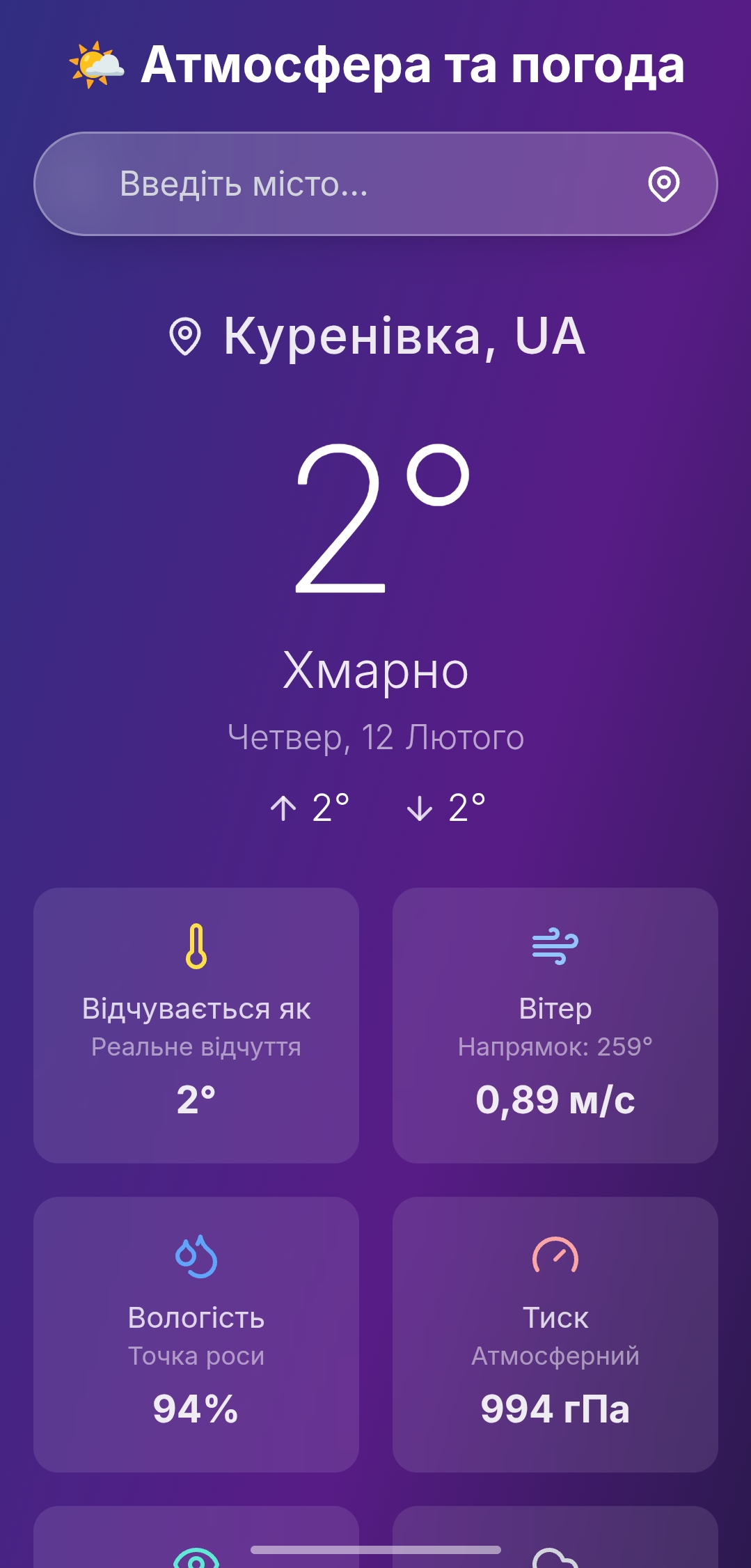
Full adaptation of the design for mobile devices and tablets.
What has been done:
Implementation of a hamburger menu with animation.
Adaptation of fonts and margins for comfortable reading on a phone.
Testing on real devices (iOS Safari, Chrome Android).
Passing the Google Mobile-Friendly test.
The layout displays correctly on screens from 320px to 4K.
What has been done:
Implementation of a hamburger menu with animation.
Adaptation of fonts and margins for comfortable reading on a phone.
Testing on real devices (iOS Safari, Chrome Android).
Passing the Google Mobile-Friendly test.
The layout displays correctly on screens from 320px to 4K.