NOVA Sweets | B2B E-commerce Landing Page & Brand Identity
Web Design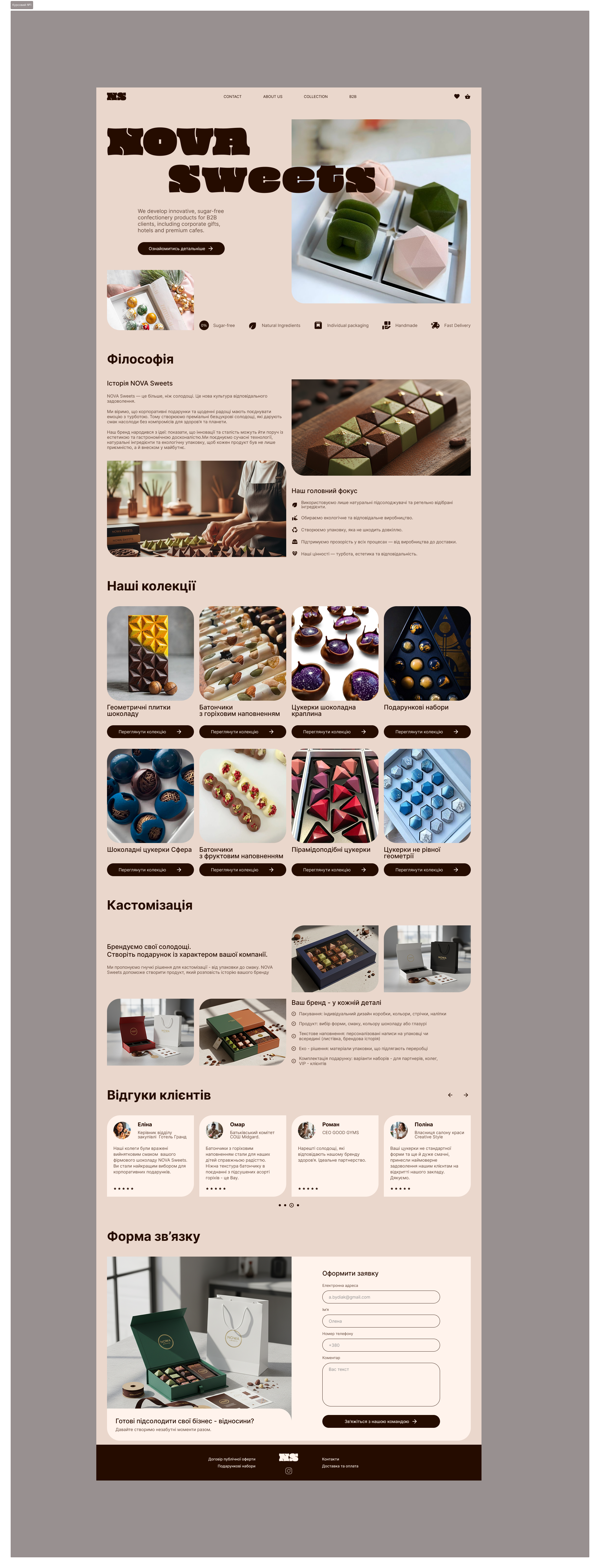
Project Overview: NOVA Sweets is an innovative B2B confectionery brand specializing in premium sugar-free sweets. The main task was to develop a landing page design that would help the company attract corporate clients, representatives from the HoReCa segment, and gift curators. The website was to convey the brand's key values: aesthetics, health consciousness, eco-friendliness, and uncompromising quality.
The Challenge: It was necessary to create a user-friendly, intuitive, and visually appealing one-page website. It had to not only showcase the unique product (craft chocolate products in complex geometric shapes) effectively but also meet the specific needs of a demanding B2B audience. A particular challenge was to visually demonstrate the customization options for the product under the client's corporate brand and to build trust by revealing the company's philosophy.
The Solution: To convey a sense of premium quality and naturalness of the product, I chose a warm, natural color palette: deep shades of dark chocolate, soft tones of craft paper, and muted green that emphasizes the eco-friendly approach to production.
Typography: The use of expressive, bold accent font in the headings highlights the brand's boldness and modernity, allowing it to stand out confidently against classic competitors in the sweets market.
UI/UX Architecture: The page structure is built on the principle of sequential storytelling. The user follows a logical path: from an emotional introduction to the concept in the Hero section, through an immersion in the brand's philosophy and an overview of the collections, to a specific commercial B2B offer (customization) and, ultimately, to the target action — filling out the contact form.
Focus on the product: The space is not overloaded with unnecessary visual noise. This allows the attention to be focused on large, detailed photographs of the products, so the client can examine the texture and perfect shape of the candies — a key factor in decision-making in the premium segment.
#UIDesigner #WebDesigner #UXDesigner #FigmaDesign #UserExperience #FigJam