Packaging for dried fruits
Print Design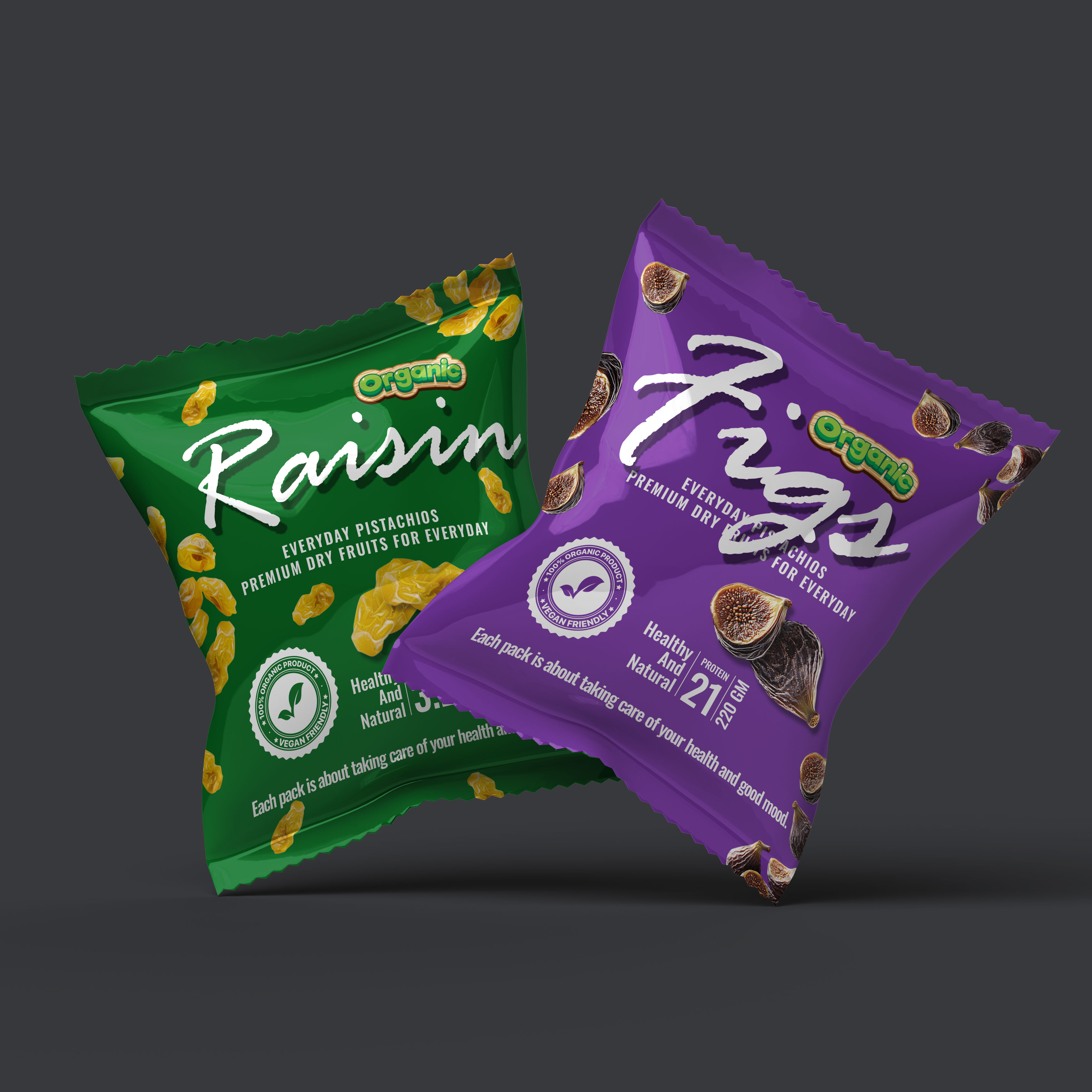
Sometimes the best ideas come simply when you sit down and start creating. This is how this packaging for dried fruits was born. It was important to combine a design that would simultaneously attract attention and provide convenience for the consumer.
The color palette plays a key role: green for raisins and purple for figs subconsciously hint at the benefits and naturalness of the product. They clearly distinguish different flavors and ensure instant recognition on the shelf.
Ergonomics was also in focus. The compact size and shape of the packaging allow the product to comfortably fit in the hand, while the dynamic angle in the composition creates a sense of movement and modernity.