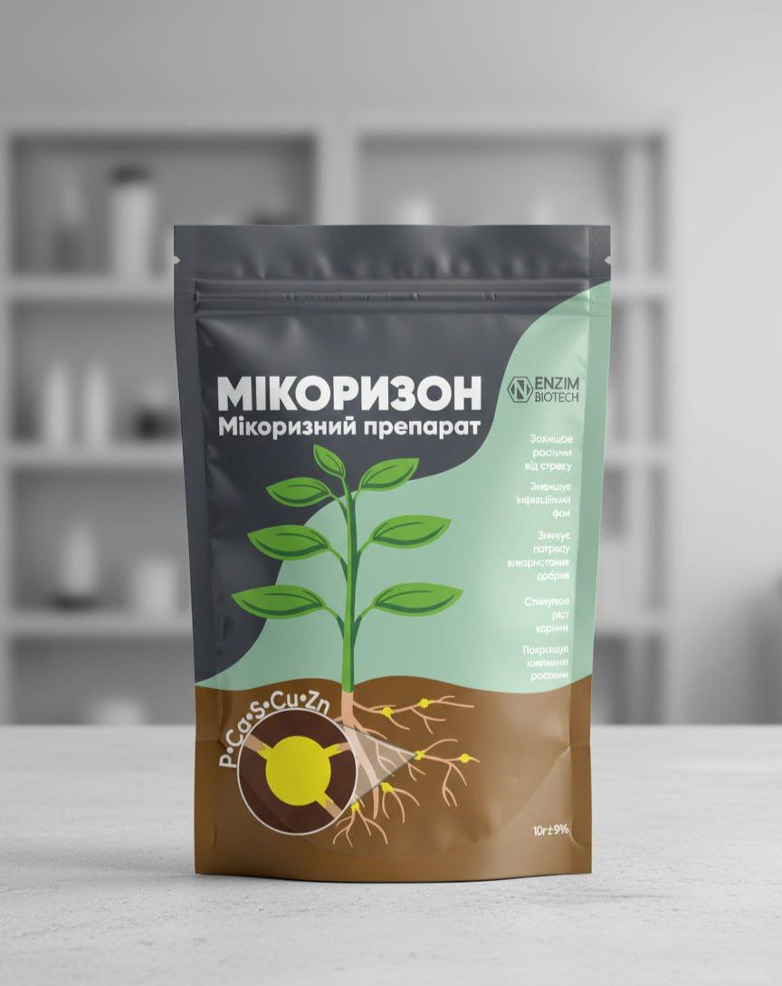
Task: Develop packaging design for a new product — the biopreparation "Mycorrhiza." The key requirement was to move away from the standard "garden" aesthetics. It was necessary to create a clean, technological, and modern image that would emphasize the scientific basis of the product and instill trust in the consumer.
Solution: I proposed a concept that combines minimalism with clear infographics.
Style: Instead of being overloaded with elements, the focus was on clean lines, a large amount of "air" in the design, and clear typography.
Colors: A professional palette was chosen that conveys expertise: deep green (nature), clean white (science, purity), and accent gray.
Informative: The key advantages of the preparation are presented in the form of understandable icons.
Result: The client received a stylish and competitive design that favorably highlights the product on the shelf and creates an image of a reliable, scientifically-based preparation.
Most importantly — I provided not just a visualization, but a fully print-ready layout that takes into account all the technical requirements of the printing house and the packaging material.