Packaging design "Tofu Cat"
Packaging and label design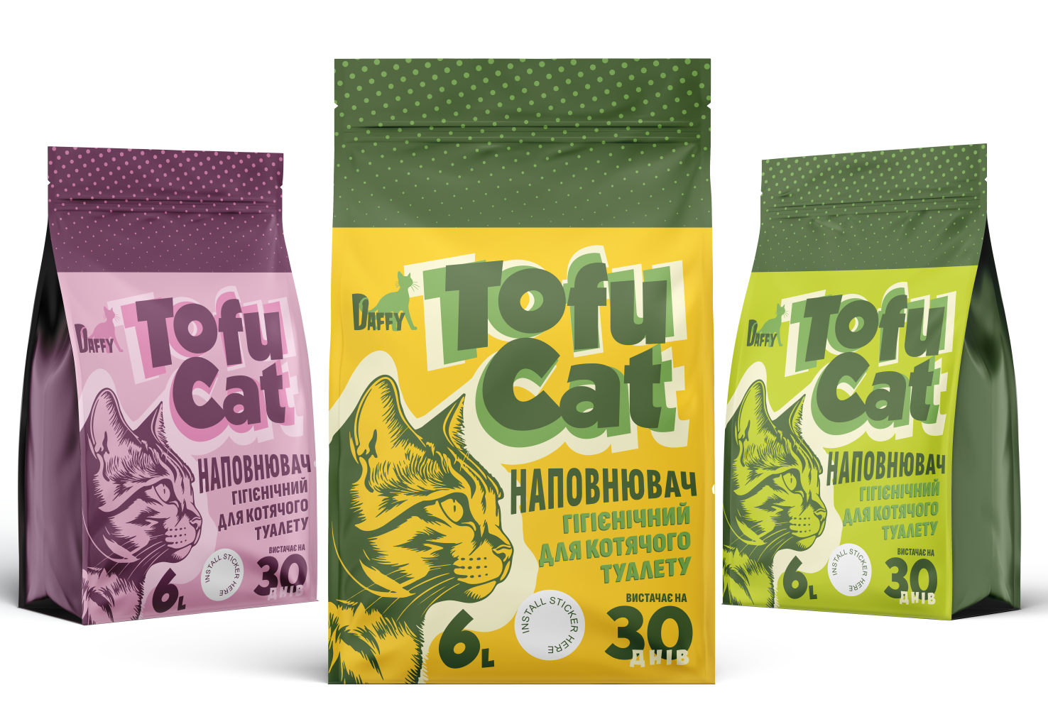
Product type: Cat litter filler
Packaging format: Stand-up pouch with resealable zipper
Volume: 6 liters
Manufacturer/brand: Daffy
Visual style and branding
The packaging design is created in a bright pop-art style, combining illustrative elements with a strong typographic accent. The main focus is the “Tofu Cat” logo, executed in a bold font with a shadow that creates a sense of volume and brand recognition. The color choices are saturated and contrasting: yellow, green, pink, purple – each variant has its own palette, allowing convenient segmentation of aromatic lines or product types.
Illustration
The key visual element is an illustration of a cat in profile, stylized like an engraving or linocut, adding recognizability and an art mood. This approach alludes to craftsmanship, which can symbolize care for the naturalness and safety of the product.
Typography
Font choices combine a bold headline font for the brand name with functional fonts for the information block. All key data (volume, usage period, type of filler) are highlighted contrastively, easily readable, and placed in the customer’s direct attention zone.
Color scheme
Colors are selected with consideration for high shelf visibility and clear differentiation between product variants. The background features zoned areas with the upper part filled with a dotted pattern — this adds rhythm and visual balance to the packaging.
Functionality
The packaging shape — a zippered pouch — implies multiple uses and convenient storage. This modern solution meets the expectations of the target audience in the “middle” and “premium” segments.
The “Tofu Cat” packaging design is a successful example of combining emotional appeal, brand recognition, and functional structure. It creates a bright visual identity, immediately communicates the product category, and, thanks to color variations, is easily scalable across a broad product line. The design works on both an emotional level (through the cat illustration) and a rational level (through clear presentation of benefits).
#packagingdesign #branding #identity #corporateidentity #packaging #packagingdesign #graphicdesign #productdesign #branddesign #ecoDesign