PITO Dog Food — a conceptual project for the development of a brand and packaging for dog food.
The inspiration was the idea of creating a modern, friendly, and recognizable brand image that evokes trust in pet owners and positive emotions.
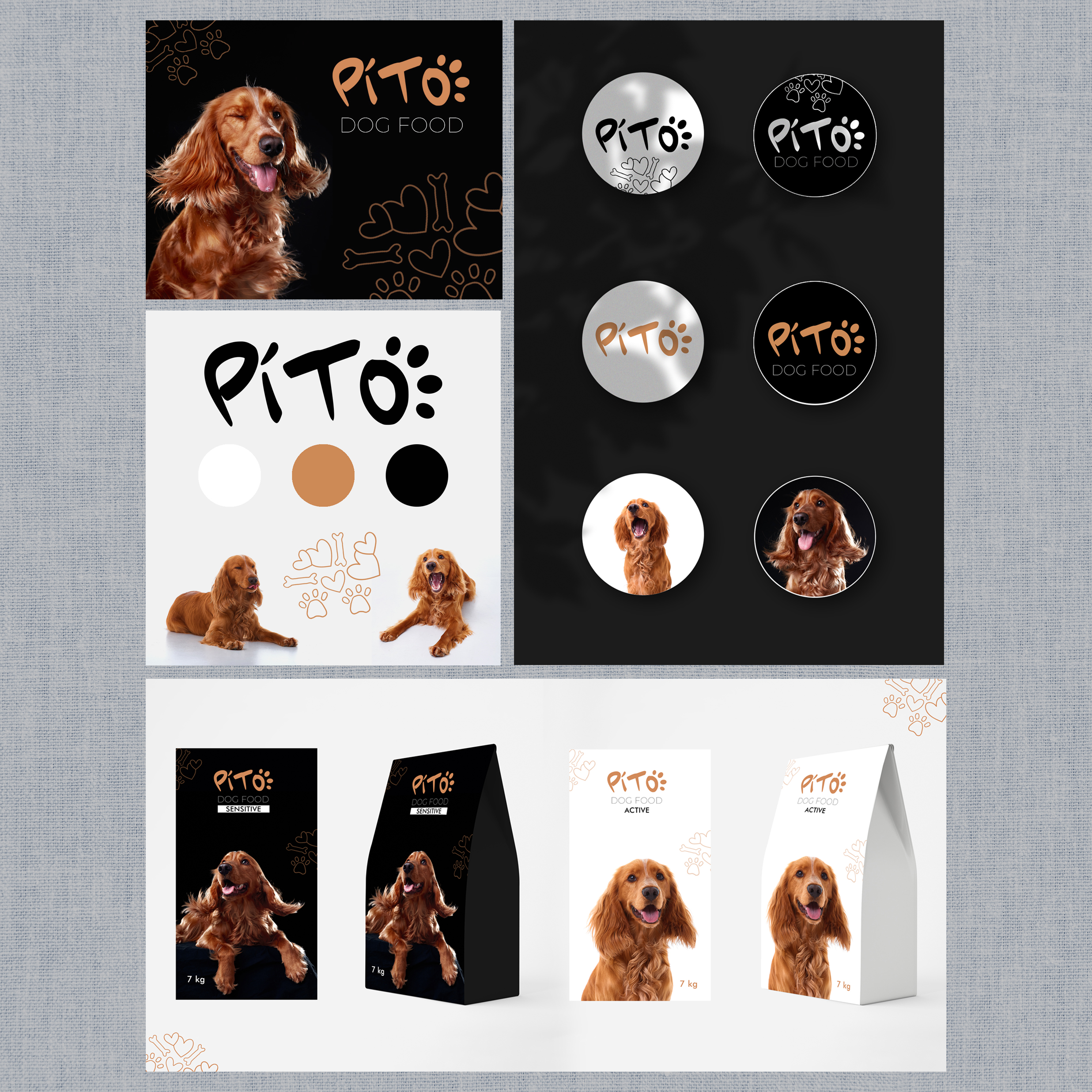
Dog model. A photoshoot was conducted in the studio with a red cocker spaniel. His charismatic facial expression and energy became the foundation of the identity: he symbolizes joy, loyalty, and health provided by proper nutrition.
Logo. The name PITO features a playful accent — the letter "O" is stylized as a paw print. This gives the logo a friendly and recognizable character. The font is light, rounded, with a sense of movement.
Colors. A black background was chosen for the Sensitive series — it emphasizes elegance and care, creating an association with delicacy and premium quality. A white background was used for the Active series — it is associated with energy, freshness, and lightness. Additional accents include a warm terracotta color that resonates with the shade of the dog's fur.
Packaging. Demonstrated options for different lines:
Sensitive — for dogs with sensitive digestion;
Active — for active and energetic pets.
The design combines expressive photographs, clean backgrounds, and minimalist decorative elements (paws, bones, hearts), creating a modern, pleasant, and trustworthy visual style.
--------------------------------
Photo by Kirill Grivenyuk
The inspiration was the idea of creating a modern, friendly, and recognizable brand image that evokes trust in pet owners and positive emotions.
Dog model. A photoshoot was conducted in the studio with a red cocker spaniel. His charismatic facial expression and energy became the foundation of the identity: he symbolizes joy, loyalty, and health provided by proper nutrition.
Logo. The name PITO features a playful accent — the letter "O" is stylized as a paw print. This gives the logo a friendly and recognizable character. The font is light, rounded, with a sense of movement.
Colors. A black background was chosen for the Sensitive series — it emphasizes elegance and care, creating an association with delicacy and premium quality. A white background was used for the Active series — it is associated with energy, freshness, and lightness. Additional accents include a warm terracotta color that resonates with the shade of the dog's fur.
Packaging. Demonstrated options for different lines:
Sensitive — for dogs with sensitive digestion;
Active — for active and energetic pets.
The design combines expressive photographs, clean backgrounds, and minimalist decorative elements (paws, bones, hearts), creating a modern, pleasant, and trustworthy visual style.
--------------------------------
Photo by Kirill Grivenyuk