and travel. A tourist company looking for tourists
Web Design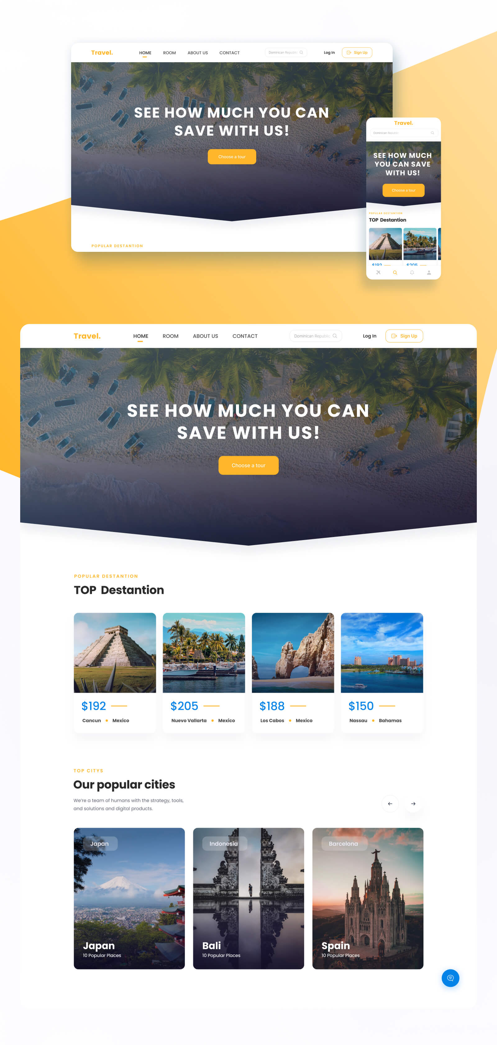
Why the yellow color?Yellow is associated with warmth, joy and beach, so yellow causes the best association.The rest is always associated with something light, soft, so the land is easily rounded, and light shade is used on the elements.
The background is clearly white or grey.It does not overload the site, it allows you to distinguish the necessary information and photos.It also makes the whole text more readable.As for redistribution.Hat: used all the menu points, added a place to the logo, search placed on one line, now it is noticeable.She transferred the entrance, added the registration and distinguished them as there is the need to attract new users.The Main Screen:
She took the excess text from the main screen and left only the important (to not overload the user, and the text from the site does not carry meaningful load and the user must understand where he got), placed the juice photo (calling the association with the rest), and down made the outbreak (the user will intuitively want to slide down), issued the button to select the tour (this is the most important and leads to the target action)
The site should attract attention at first glance, otherwise there is a great chance of losing a user to the benefit of the competitors with whom you will be compared to the user and he will.Popular distances
The user consumes information by eye and first of all draws attention to the photo, and last to the text, so the decision is made to distinguish each offer and visualize it with a photo that will attract attention first.