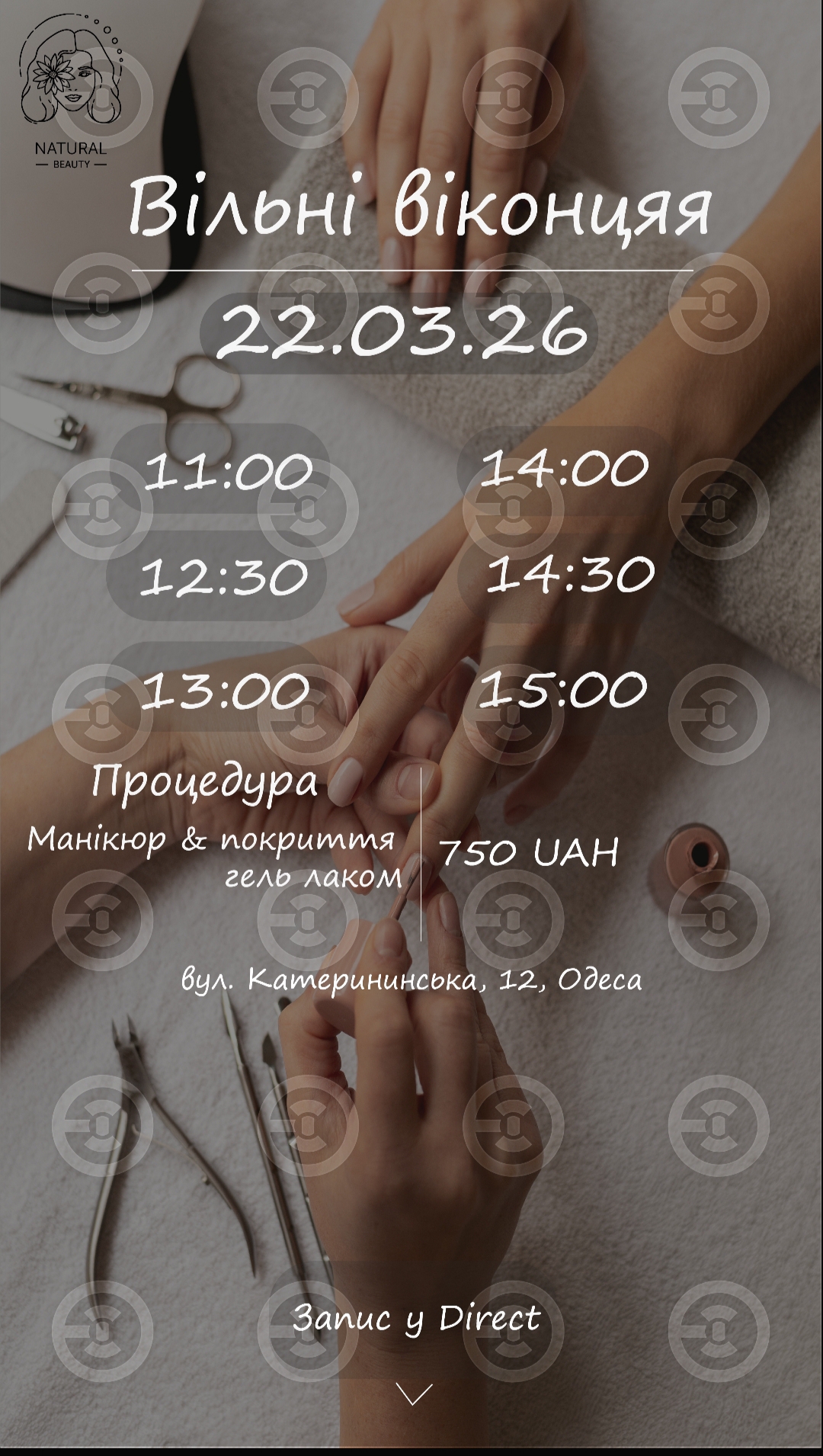
Creation of an aesthetic and functional layout for stories to inform clients about available slots for procedures. The main goal is to make the information easy to read while maintaining a premium and "clean" visual style of the studio.
What has been done:
Visual concept: A muted, natural color palette (nude/beige) has been used to emphasize the brand name "Natural Beauty."
Typography work: A readable handwritten font has been selected, adding "humanity" and softness to the design, which is important for the service industry.
Accents: The use of semi-transparent blocks under the time slots to enhance contrast and ease of perception against the photo background.
Composition: A clear hierarchy of information — first the date, then the time, service description, and price. At the bottom, there is a CTA (call to action) and the address.
What has been done:
Visual concept: A muted, natural color palette (nude/beige) has been used to emphasize the brand name "Natural Beauty."
Typography work: A readable handwritten font has been selected, adding "humanity" and softness to the design, which is important for the service industry.
Accents: The use of semi-transparent blocks under the time slots to enhance contrast and ease of perception against the photo background.
Composition: A clear hierarchy of information — first the date, then the time, service description, and price. At the bottom, there is a CTA (call to action) and the address.