Design of the Logo MOONLEAF
Logo Design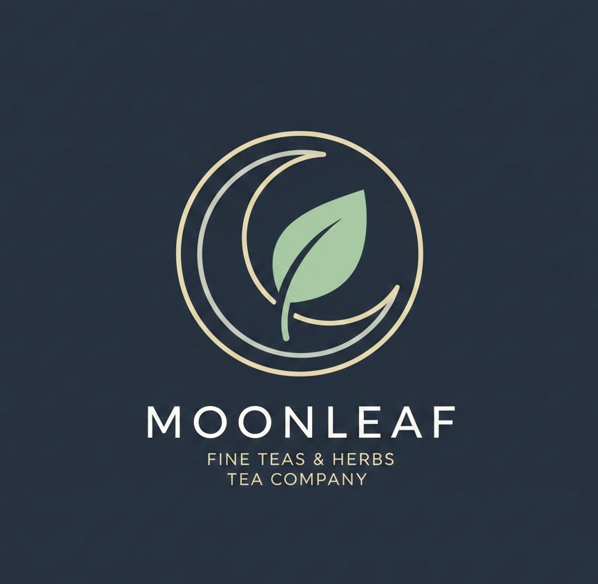
Concept: Minimalist Calm
The Moonleaf logo combines the carefree nature of the Moon and the freshness of a Leaf into a single, cohesive mark. The focus during development was on minimalism and clean geometry to convey a sense of premium, high-quality tea products.
• Iconography: A simple upward-pointing leaf shape, subtly embraced by the arc of a crescent moon. This visual synergy symbolizes growth, purity, and tranquility.
• Aesthetics: Achieved through uniform line thickness and a clean sans-serif font. The minimalist execution ensures excellent scalability and a sophisticated, timeless appearance suitable for packaging and branding.
The result is an elegant, understated mark that embodies the quiet ritual of high-quality tea drinking.
#logotype #logodesign #GraphicDesign #Branding