Pull-up bars UKR
Web Design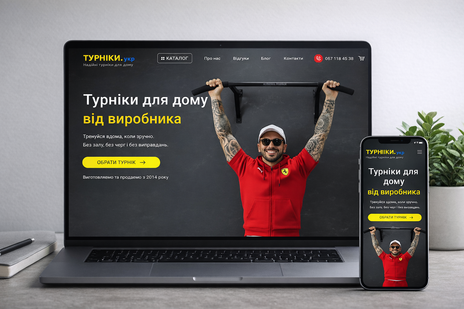
In this project, I performed a careful redesign of the existing website without changing its structure and logic. The main focus was on visual updating and enhancing usability.
During the work process, I optimized typography, established a clear hierarchy of texts, and improved the readability of the content. Significant attention was paid to working with margins and spacing — this allowed to "unload" the interface, add a sense of airiness, and make the pages neater.
The color palette was also harmonized for better visual balance and ease of perception. UI elements received a light update: they became more modern, neat, and consistent with each other, while maintaining brand recognition.
The result was a clean, modern, and comfortable-to-use interface that looks relevant without losing the logic and structure of the original website.