Ratio Buro specializes in precise and elegant architectural designs that balance form and function. With a focus on structure and innovation, the firm delivers tailored solutions that reflect both beauty and practicality, combining modern aesthetics with a deep understanding of architectural principles.
Solution
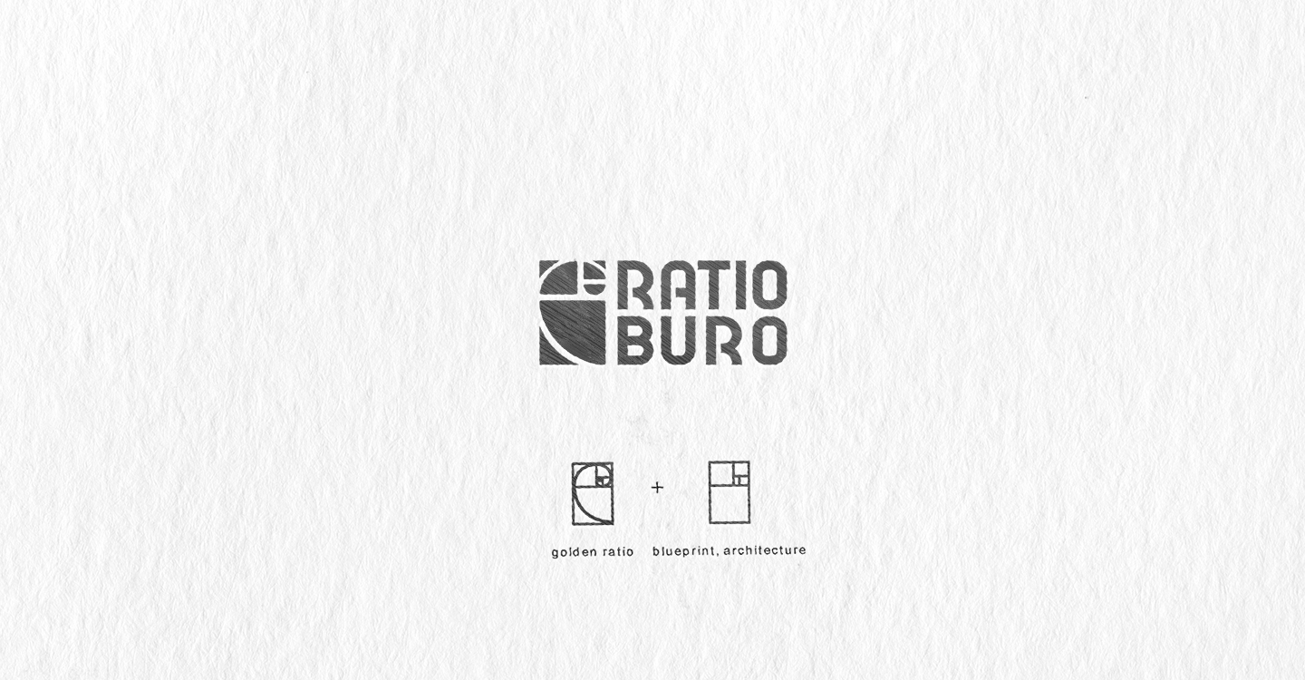
When designing the logo, I turned to the concept of the Golden Ratio- a key principle widely used in architecture, which emphasizes the name of company. The logo includes an icon in the form of a Golden Ratio drawing, which also evokes associations with architectural plans and blueprints. This visual element elegantly and concisely reflects the company’s area of expertise.
For the text portion, I selected a modern font that combines style with readability. Additionally, I refined the text to achieve optimal alignment within a rectangular shape, enhancing the sense of rationality and precision- key attributes of the company.
Solution
When designing the logo, I turned to the concept of the Golden Ratio- a key principle widely used in architecture, which emphasizes the name of company. The logo includes an icon in the form of a Golden Ratio drawing, which also evokes associations with architectural plans and blueprints. This visual element elegantly and concisely reflects the company’s area of expertise.
For the text portion, I selected a modern font that combines style with readability. Additionally, I refined the text to achieve optimal alignment within a rectangular shape, enhancing the sense of rationality and precision- key attributes of the company.