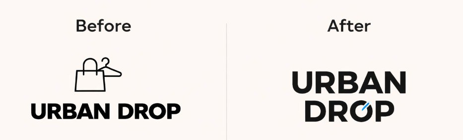
URBAN DROP — an online store for youth clothing. The goal of the rebranding was to update the logo, making it more modern, recognizable, and adapted to the digital environment. In the old version, the logo consisted of a basic bold font and a standard symbol, which looked overloaded and did not create a unique brand style. This approach did not align with modern streetwear trends and performed poorly on social media and in small formats.
In the new design, the logo is built exclusively on typography. I used a modern grotesque font and created an accent in the word DROP through a unique graphic detail in the letter O, which adds recognizability and forms the identity without unnecessary elements. The logo has become cleaner, bolder, and more versatile for use on the website, in social media, on clothing tags, and packaging.
In the new design, the logo is built exclusively on typography. I used a modern grotesque font and created an accent in the word DROP through a unique graphic detail in the letter O, which adds recognizability and forms the identity without unnecessary elements. The logo has become cleaner, bolder, and more versatile for use on the website, in social media, on clothing tags, and packaging.