Redesign logo
Logo Design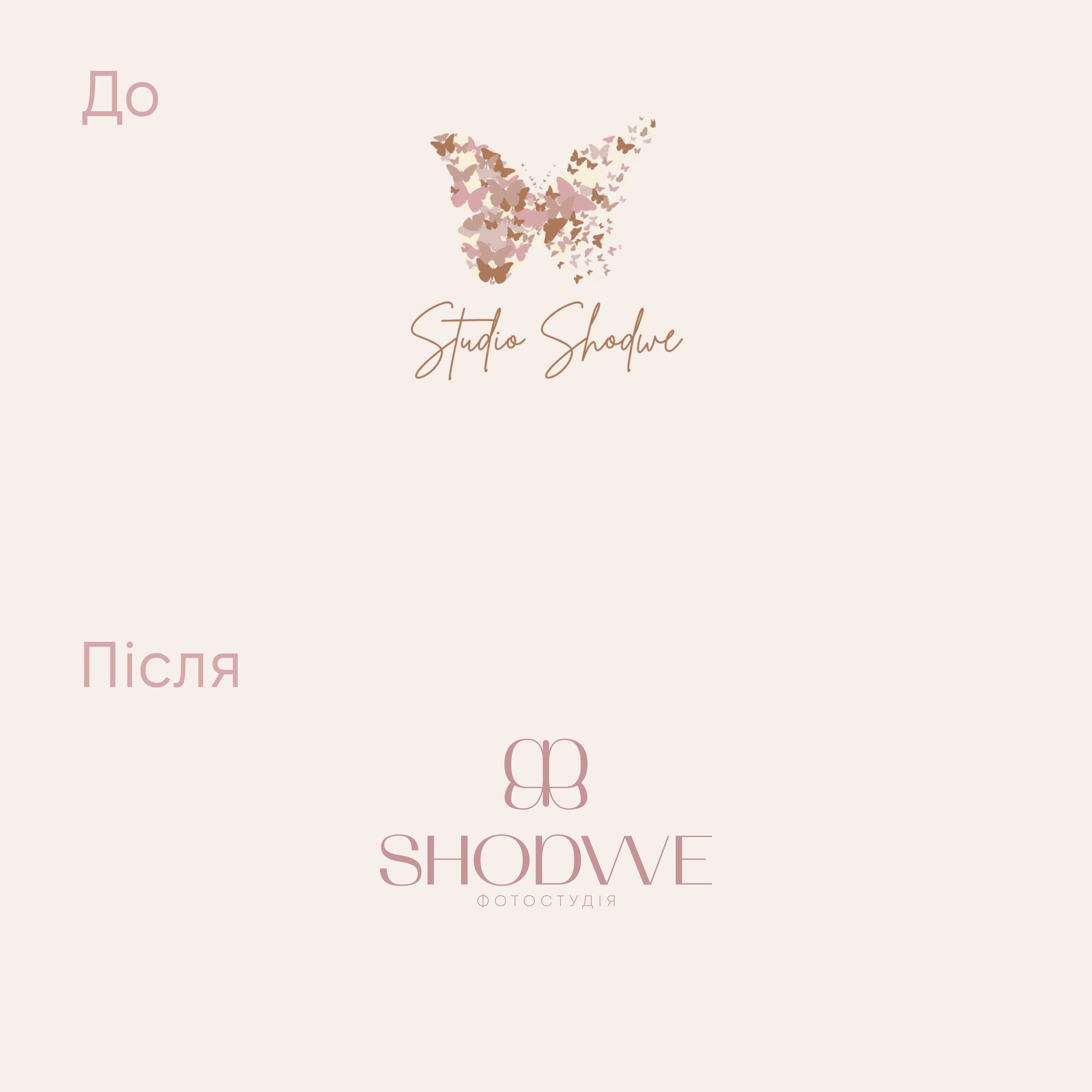
Redesign of the logo for a photo studio.
What has been done:
- clearer and more understandable font
- clear, memorable sign, but KEPT the association with a butterfly
- colors kept in a similar palette so that the new logo is not radically different, but retains familiar features for its clients.
#logo #redesign #graphic design
What has been done:
- clearer and more understandable font
- clear, memorable sign, but KEPT the association with a butterfly
- colors kept in a similar palette so that the new logo is not radically different, but retains familiar features for its clients.
#logo #redesign #graphic design