Task: to create a redesign in a minimalist style, adhering to the fonts/colors and ideas from the brand book.
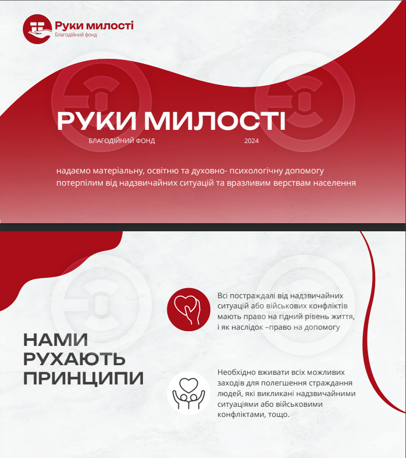
- The design was created in accordance with the fonts/colors of the brand book. The main element of the corporate identity - the wave - was used.
"Waves symbolize movement and change, reflecting achievements, progress, and improvement which are key aspects of the charity's activities. They represent collaboration and support, uniting various human efforts and resources towards a common goal of enhancement."