Task: Develop a premium brand for a company that arranges residency and visas in the Emirates. Target audience — affluent clients and businessmen.
What has been implemented:
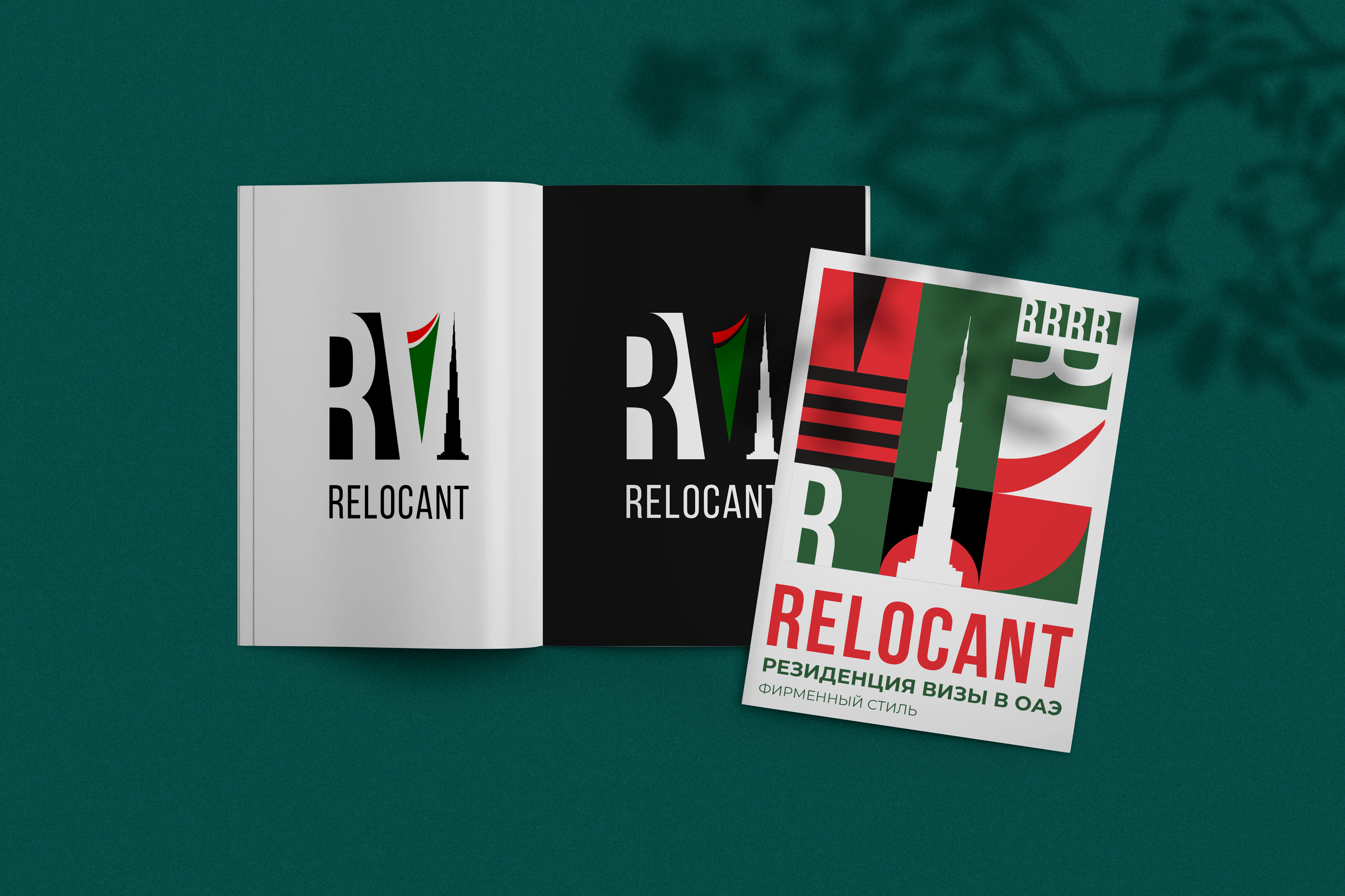
Logo: A minimalist sign combining the letters R and V (Relocant / Resident Visa). Hidden meanings are incorporated into the geometry: a curve (airplane trail/move) and a sharp triangle (silhouette of Burj Khalifa).
Stylistics: A mix of Swiss design school (strictness, grid, reliability) and elements of Bauhaus (geometric patterns and dynamics).
Color solution: A unique palette based on the UAE flag (green, orange-red, black), adapted for the business segment without direct copying.
Corporate identity: A system of patterns and visual standards has been created, emphasizing the status and Swiss precision of the service.
Result: A concise, expensive visual language that inspires trust and distinguishes the company in the international consulting market.
What has been implemented:
Logo: A minimalist sign combining the letters R and V (Relocant / Resident Visa). Hidden meanings are incorporated into the geometry: a curve (airplane trail/move) and a sharp triangle (silhouette of Burj Khalifa).
Stylistics: A mix of Swiss design school (strictness, grid, reliability) and elements of Bauhaus (geometric patterns and dynamics).
Color solution: A unique palette based on the UAE flag (green, orange-red, black), adapted for the business segment without direct copying.
Corporate identity: A system of patterns and visual standards has been created, emphasizing the status and Swiss precision of the service.
Result: A concise, expensive visual language that inspires trust and distinguishes the company in the international consulting market.