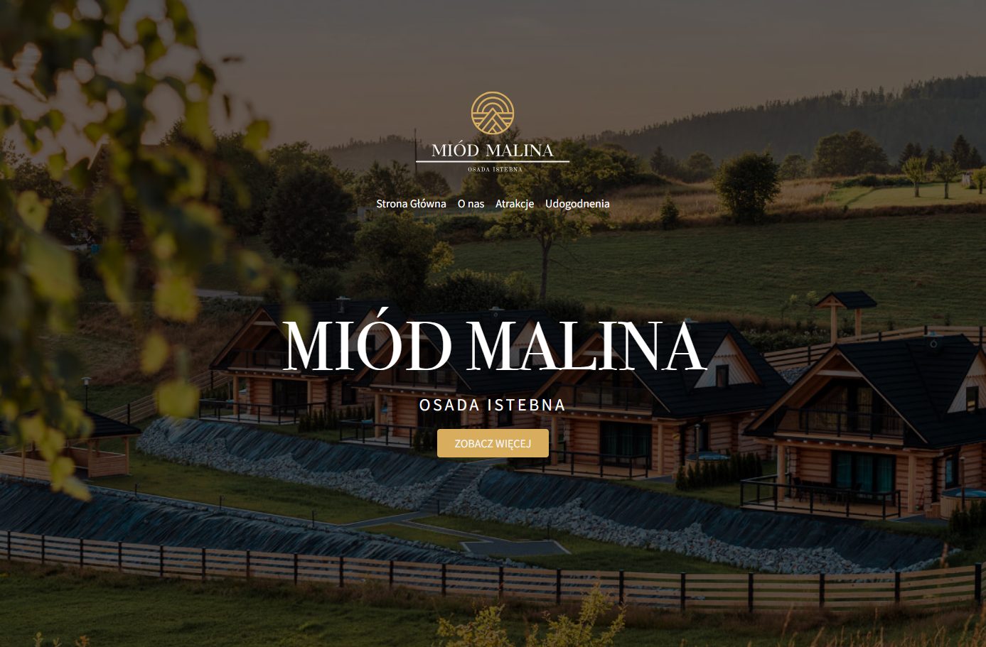
Full website layout "from scratch" — from desktop to mobile devices.
What has been done:
Responsive layout based on a single desktop mockup — I independently designed adaptations for tablets and mobile devices.
Modern technologies used:
▸ Flexbox
▸ CSS Grid
▸ media queries
▸ lazy loading for speed optimization
Semantic HTML structure — provides better SEO and convenience for screen readers.
Accessibility: keyboard navigation, focus styles, alt texts — all according to WCAG practices.
Basic SEO optimization: specified title, meta descriptions, keywords, proper heading structure.
Google Lighthouse:
▸ Performance — 100
▸ SEO — 100
▸ Accessibility — 100
▸ Best Practices — 100
Result — the site looks stylish, loads quickly, and displays conveniently on all devices.