Review of the book “Spring Armed”
Print Design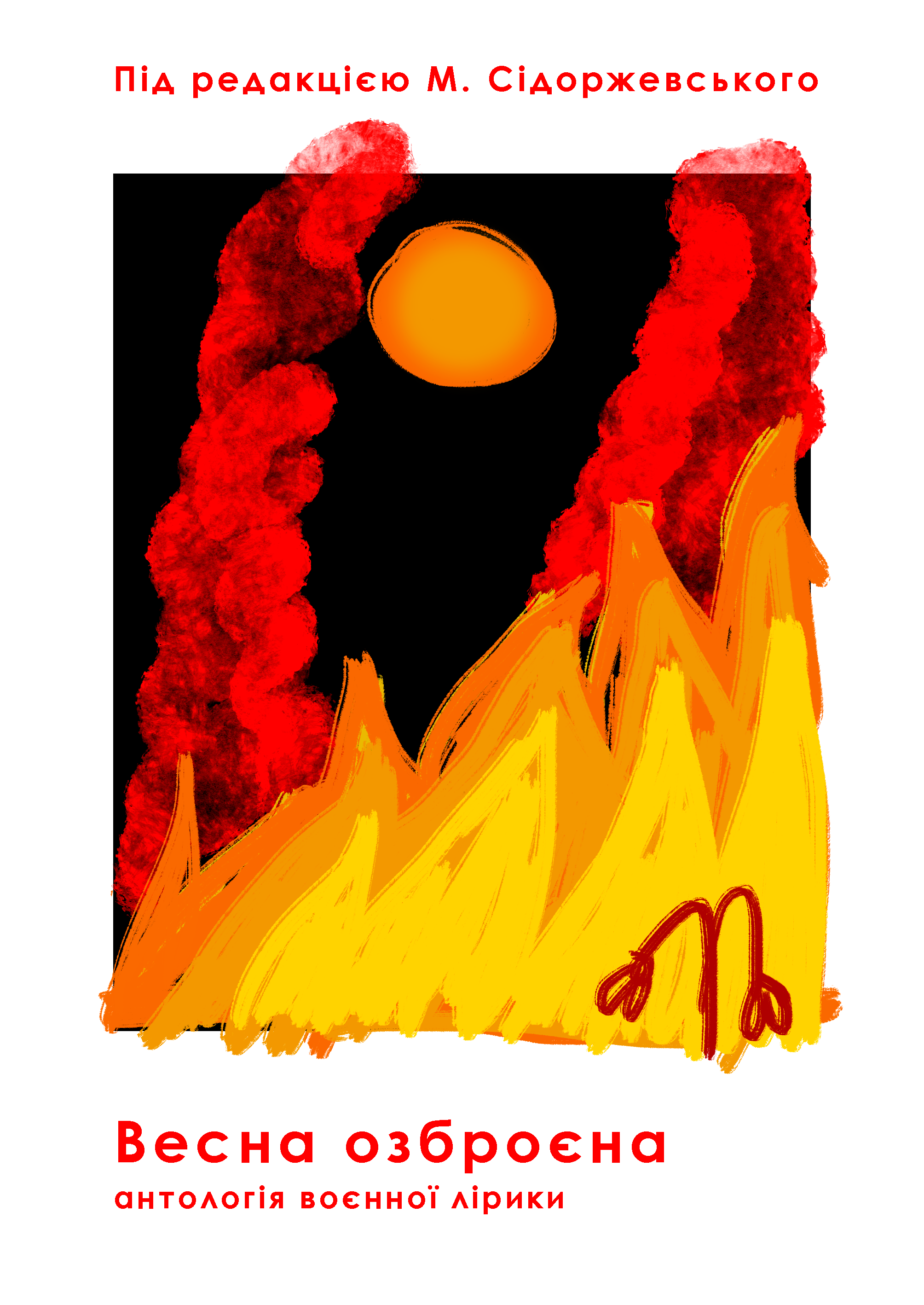
Re-design of the book "Spring Armed", under the edition of M. Sidorzevsky.
I decided to make the cover more noticeable, brighter, but not less dramatic. I also left the main images of the old storage - the fire of the war that burns everything and a lonely but strong brick that stands, despite nothing.
She has chosen a minimalist font - Century Cothic - which will not be distracted from the painting and which is suitable for the entire composition.