Logo design for the Spanish furniture company AMAX
Logo Design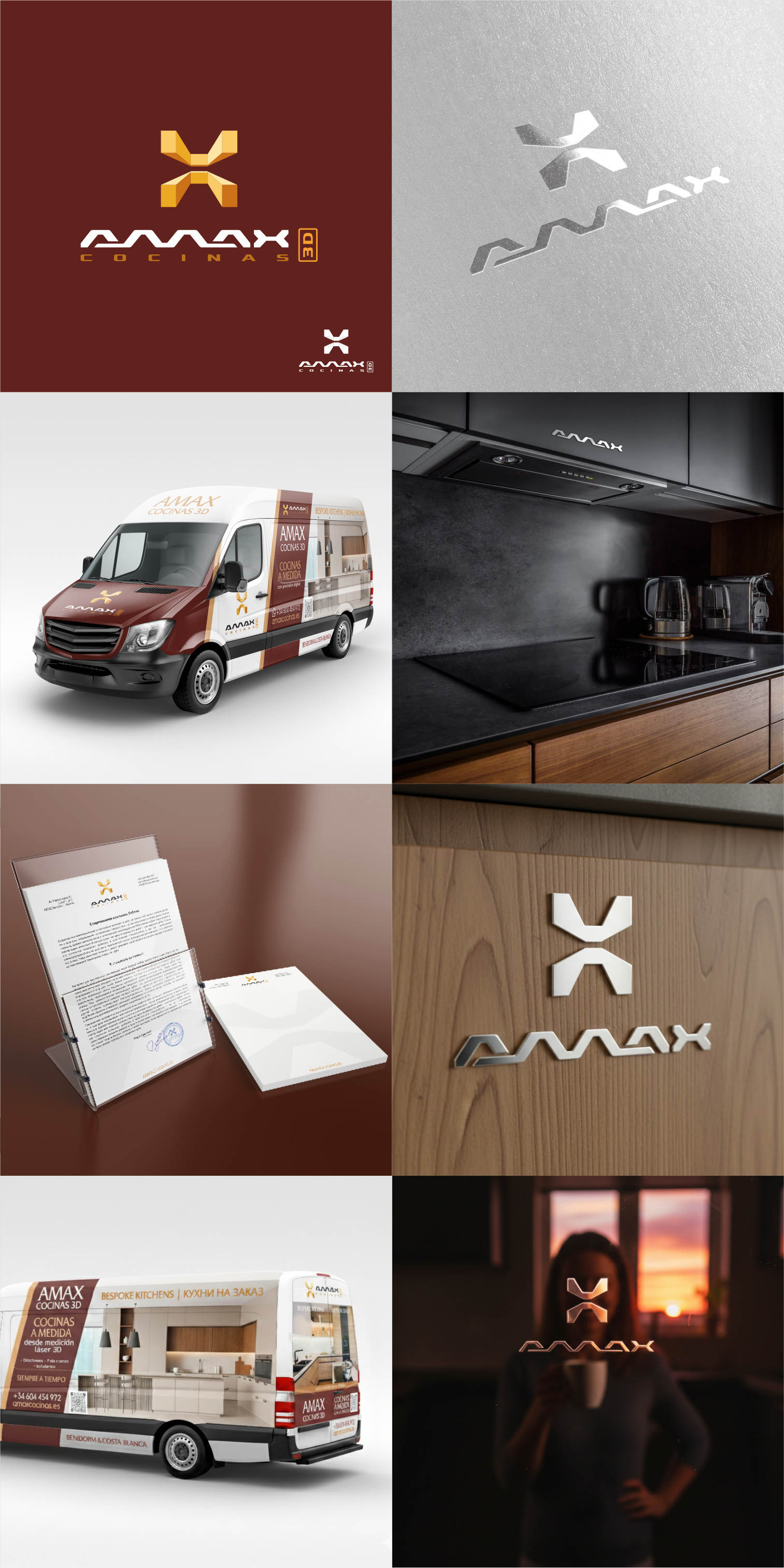
The logo's concept utilizes the letter X to create a dual meaning—representing it in the form of kitchen furniture, professionally designed and assembled by the company's specialists. A key component of the assembly process is the use of 3D lasers for precise measurements, which is also conveyed in the geometric and three-dimensional form of the logo symbol.
A unique, stylish letterform was developed for the font section that harmonizes perfectly with the graphic symbol.
The logo can be arranged in either vertical or horizontal orientation. In the monochrome version, the graphic symbol is seamless, yet retains its recognizable, easily readable shape.
Branding for the company's vehicles was also developed in close collaboration with the client.
See the logo in use on the company's current website: https://amaxcocinas.es/es/
#logobook #logo #logotype #logomaker #logodesign #logodesigner #carbranding #logobook
A unique, stylish letterform was developed for the font section that harmonizes perfectly with the graphic symbol.
The logo can be arranged in either vertical or horizontal orientation. In the monochrome version, the graphic symbol is seamless, yet retains its recognizable, easily readable shape.
Branding for the company's vehicles was also developed in close collaboration with the client.
See the logo in use on the company's current website: https://amaxcocinas.es/es/
#logobook #logo #logotype #logomaker #logodesign #logodesigner #carbranding #logobook