Website for the rental company of shopping rooms
Web Design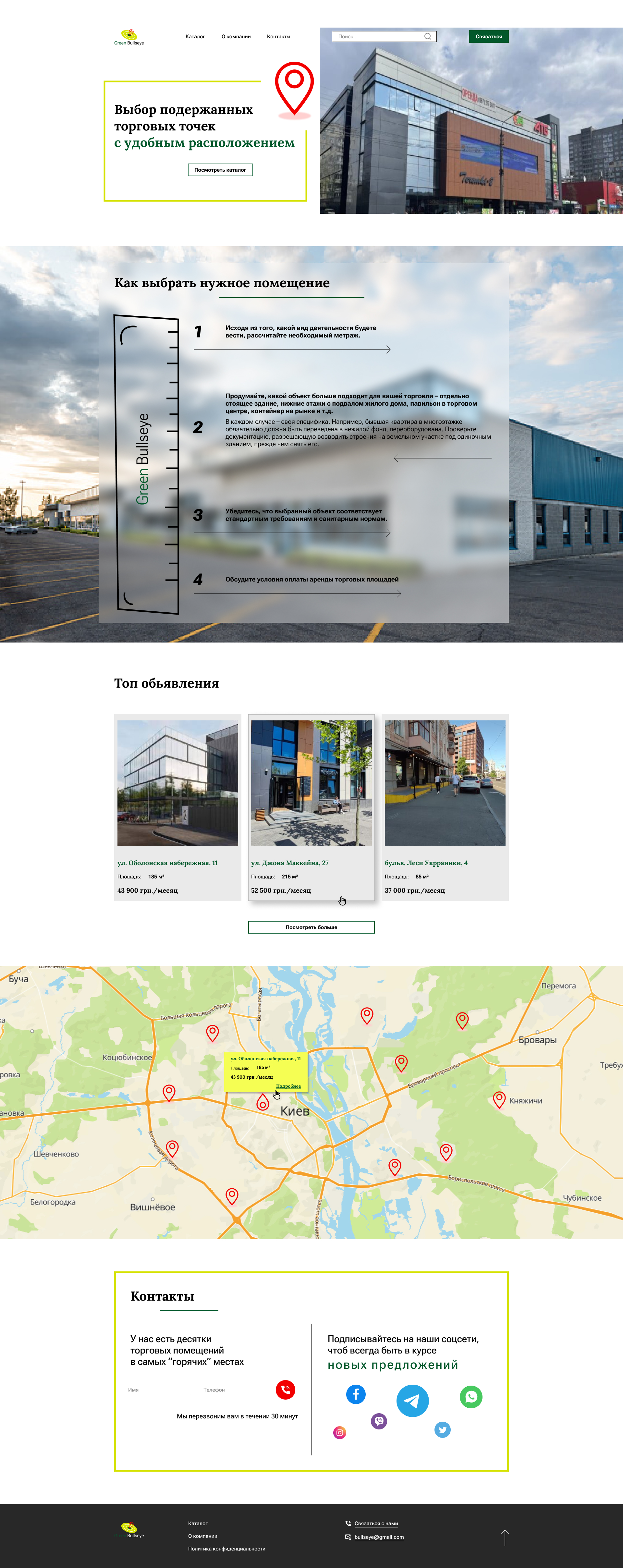
The site is made on a white background, straight angles are used without rounding to emphasize the firm’s solidity. Some blocks are “blocked” into yellow rectangles to support the brand’s color. Green is used as an accent color based on the company’s name “Green Bulleyes”. The main call to action is to leave the contact details for a feedback call, as well as to sign on the company’s social network.
The product catalogue page supports the design style set on the first page and has nothing more than the Filters for the convenient search for the required room.The Filters block is "little" and is fixed at the top of the screen when the page is scrolled so that the user can adjust the search settings at any time.
#Web Design #Figma