Brand Covorking Bookstore Shhhtab
The name
Shhhtab ( Ukr. Headquarters - the head office where the company’s headquarters is located. Shhh from English. cc, that is, the silence that is associated with the library.
Slogan
to read. to work. Grow up.
Logotype
Successfully won the name, the orange color adjusts to a friendly order and radiates life and joy, which positively affects the workability.
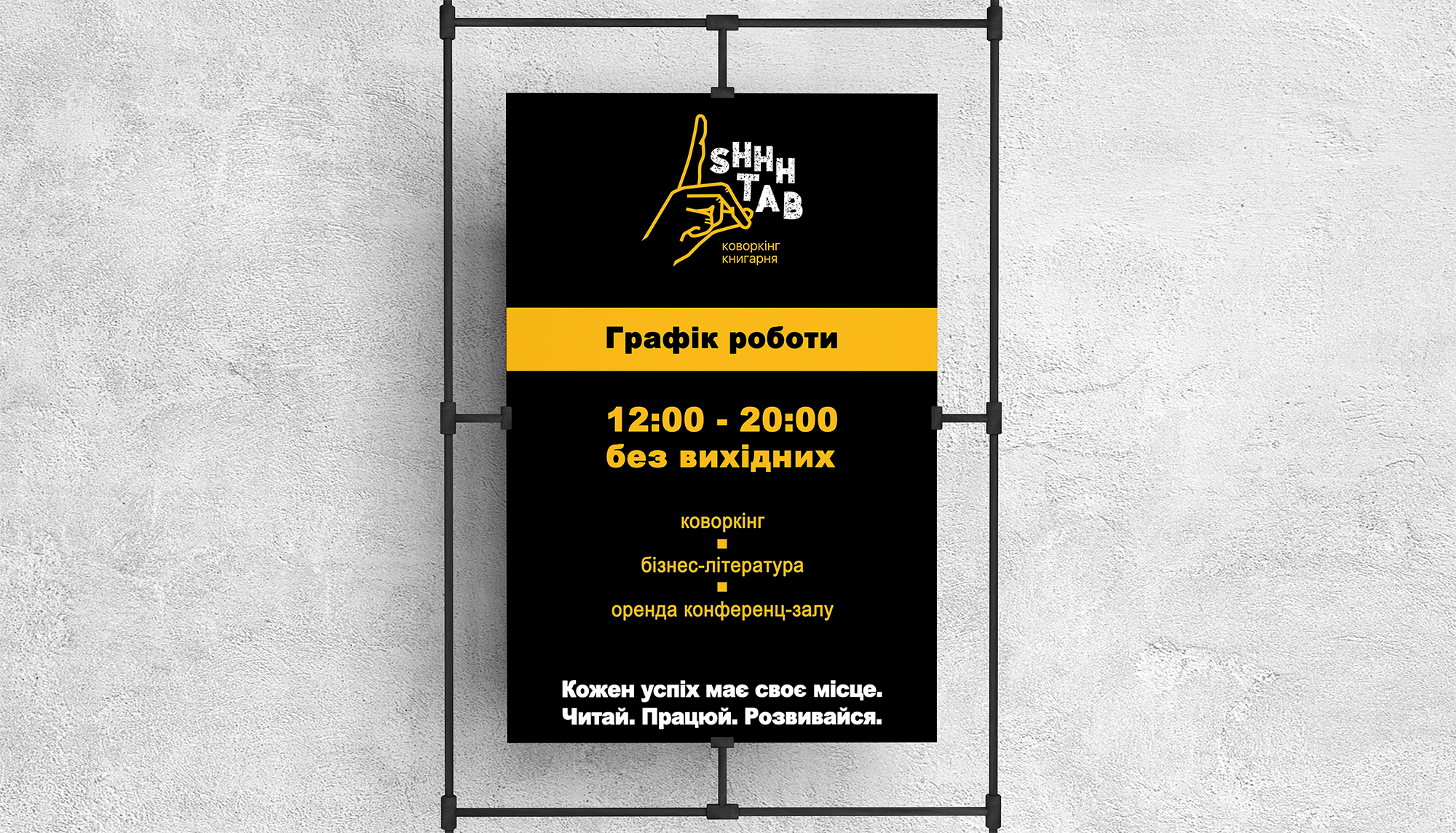
Corporate style
Shhhtab’s corporate style has been developed: visit cards, brochures, social networks and room design.
The working concept of coworking and the strategy of bringing the brand to the market is fully described. Recommendations on the scalability and development of the concept of franchise.
The name
Shhhtab ( Ukr. Headquarters - the head office where the company’s headquarters is located. Shhh from English. cc, that is, the silence that is associated with the library.
Slogan
to read. to work. Grow up.
Logotype
Successfully won the name, the orange color adjusts to a friendly order and radiates life and joy, which positively affects the workability.
Corporate style
Shhhtab’s corporate style has been developed: visit cards, brochures, social networks and room design.
The working concept of coworking and the strategy of bringing the brand to the market is fully described. Recommendations on the scalability and development of the concept of franchise.