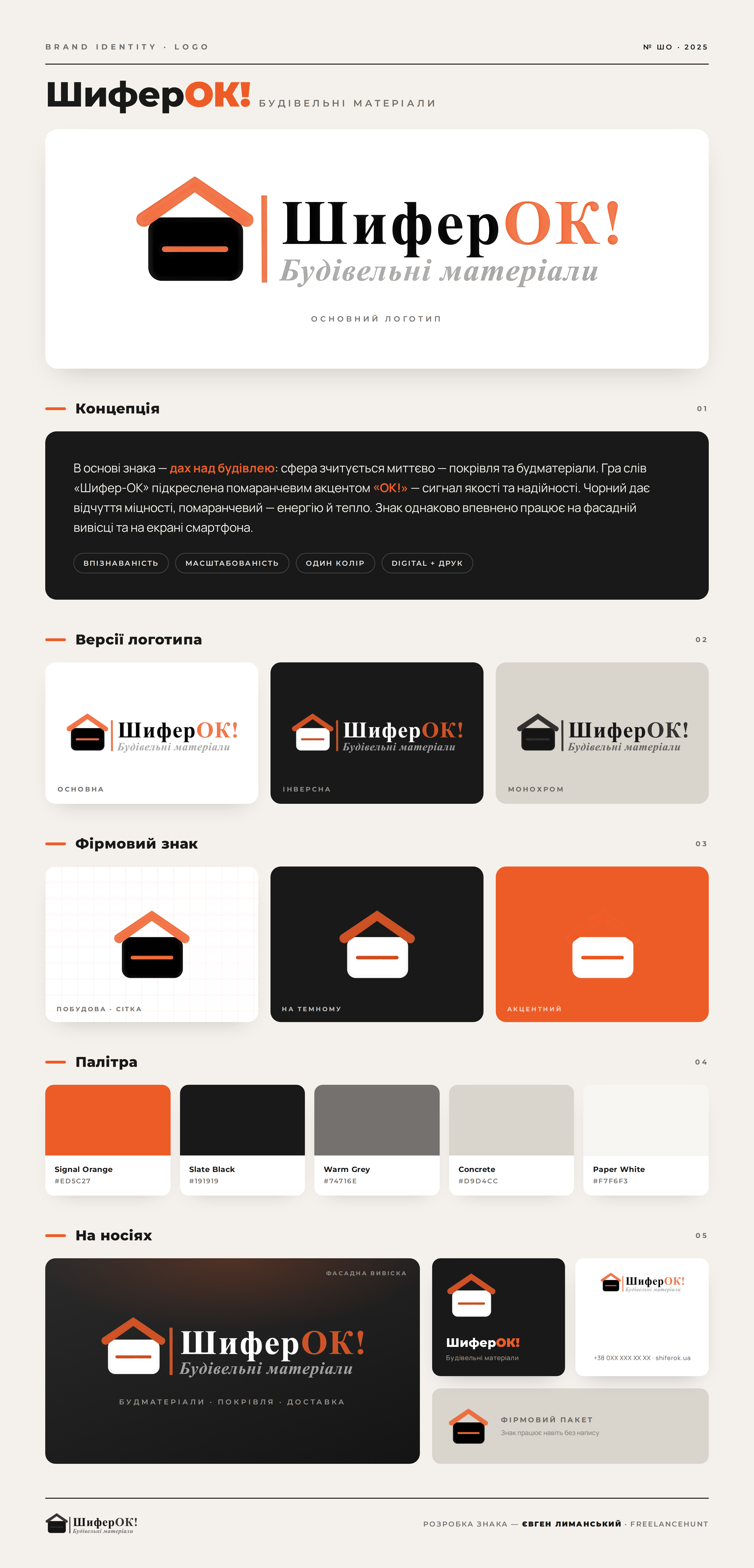
Developed a logo and brand mark for the building materials store "ShiferOK!". Concept: the basis of the mark is a roof over a building, which immediately indicates the field: roofing and building materials. The play on words "Shifer-OK" is enhanced by the orange accent "OK!" — this is read as a signal of quality and reliability. Black gives a sense of strength, while orange conveys energy and warmth. What is included in the work: — main, inverted, and monochrome versions of the logo; — a separate brand mark (icon) for avatars and social media; — a palette of brand colors with HEX codes; — demonstration on carriers: facade sign, business cards, branded bag. The logo is scalable without loss, remains readable in one color, and works equally well on the store facade and on a smartphone screen. Result: a cohesive brand mark, ready for print and use in digital, which forms brand recognition. I will achieve the same level for your brand — from idea to final files.