Sleep Mouth Tape
Packaging and label design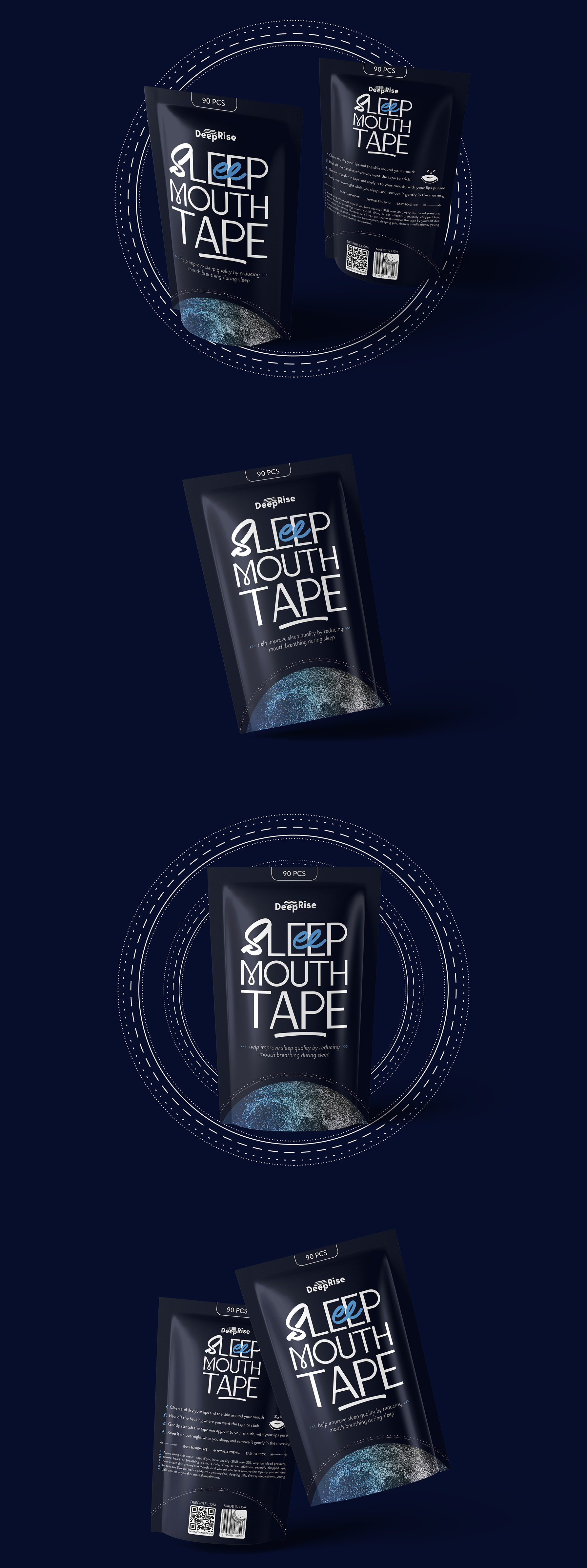
The main colour theme of the packaging turns around a deep and quiet dark-blue shade that insights the calm of the night sky. To add the element of elegance and mysticity, the bottom of the packaging is notably illustrated with a monthly motivation, which indicates the association of the product with night use.
The typography is carefully selected to be bright, discreet and distinguish from what the competitors usually use. The style of the font transmits a sense of confidence and professionalism, retaining a modern and affordable look.
The typography is carefully selected to be bright, discreet and distinguish from what the competitors usually use. The style of the font transmits a sense of confidence and professionalism, retaining a modern and affordable look.