Full design cycle for a young IT company Digital-integrations from the wonderful city of Odessa, which specializes in developing complex software solutions, web services, and mobile applications.
The main task is to create a visual image that conveys technological sophistication, professionalism, and openness of the team.
The project includes:
1) Corporate style + mockups
2) Logo development
3) UI/UX design of a responsive website
4) Presentation
Link to the project presentation with descriptions of my solutions:
https://www.behance.net/gallery/207083855/Software-development-company-UXUIBranding-ID-Logo
Concept and positioning:
The task is to convey that the company works with modern technologies and deeply immerses itself in client projects. The name Digital-integrations hints at the integration of digital solutions — this became the foundation of the brand idea.
Logo:
The logo was born from the name - Dig-In - We dig deep into problems to find the best solution.
Built on simple geometric shapes resembling a shovel. The minimalist style allows easy adaptation of the symbol for various media — from the website to presentations and business cards.
Task:
Clients wanted a stylish website with an emphasis on technological future.
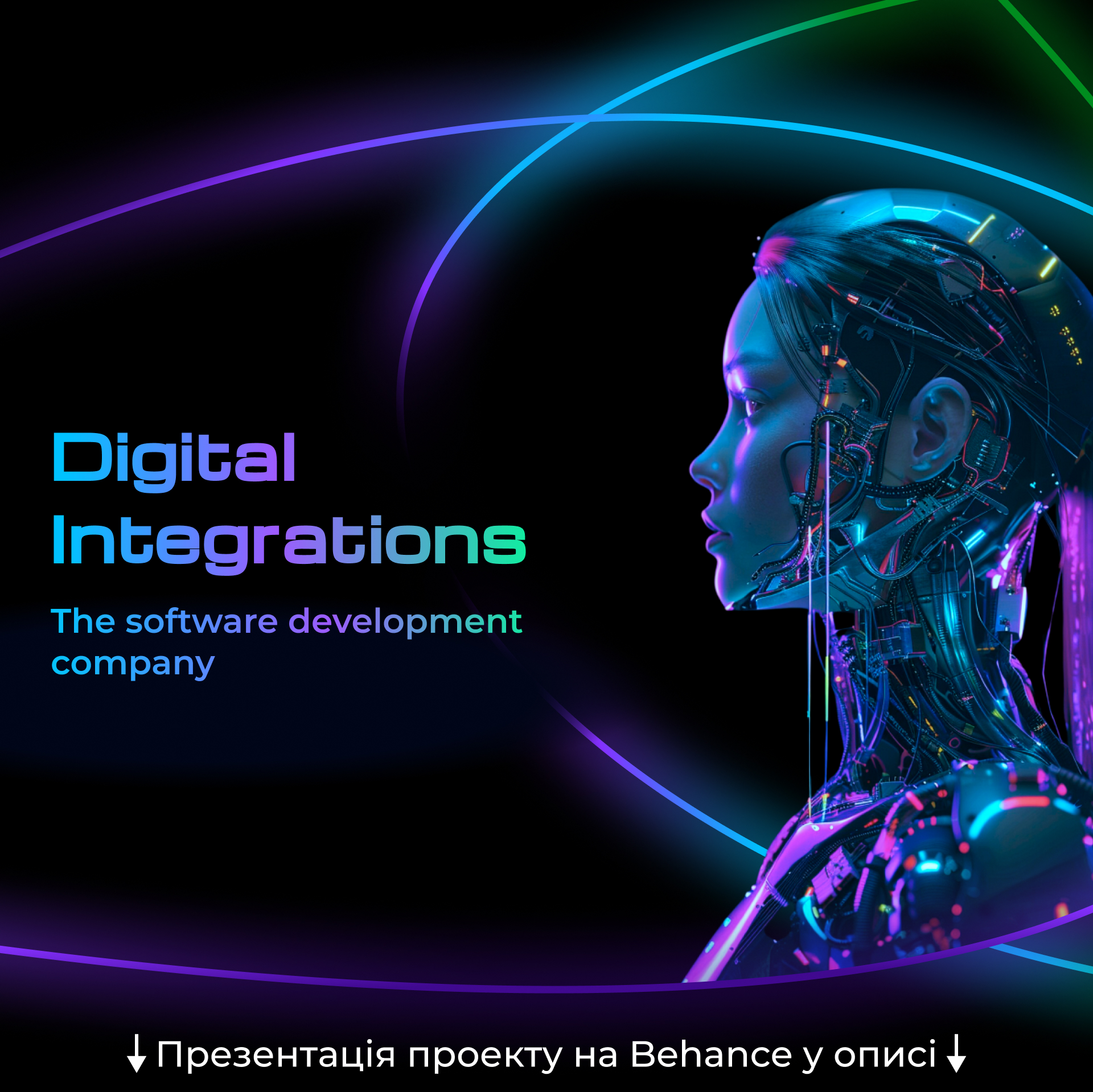
I proposed three moodboards in different styles, from which two were selected and combined into the final design: "Neon style" + "Humanoid robots".
Color and typography:
I used bright neon lines to convey technological sophistication and perfection, as well as smoothness and flexibility.
Fonts are modern, with clear straight lines — easy to read and support a digital aesthetic.
Created structure and layouts for four extensions: mobile, tablet, laptop, and desktop.
The entire system is built on an adaptive grid for a stable appearance on all devices.
Main blocks of the site:
1) Main screen — first impression: logo, slogan, call-to-action
2) About the company — concise and clear about the team and its values
3) Services — icons and brief descriptions of each category
4) Projects — a prominent button linking to a page with completed cases
5) Contacts + feedback form
All blocks are harmoniously combined but separated by transitions in the style of "Cosmic Gates" and visually balanced.
Features:
Full responsiveness with visual rhythm adherence
Bright, expressive, noticeable, but user-friendly interface — just as mom likes :)
Language system: interface available in Ukrainian / English / Russian
The project was fully implemented by me — from idea to presentation in Figma. All details, explanations of solutions, and visual materials are in the case study at the Behance link.
Link to the project presentation with descriptions of my solutions:
https://www.behance.net/gallery/207083855/Software-development-company-UXUIBranding-ID-Logo
Production time up to 8 working weeks (excluding weekends)
#Design #UIUXDesign #Logo #BrandIdentity #ITCompany #WebDesign #MobileApps #Technology #ResponsiveDesign #DigitalBrand #NeonStyle #Interface #TechDesign #WebsiteDevelopment #Odessa
The main task is to create a visual image that conveys technological sophistication, professionalism, and openness of the team.
The project includes:
1) Corporate style + mockups
2) Logo development
3) UI/UX design of a responsive website
4) Presentation
Link to the project presentation with descriptions of my solutions:
https://www.behance.net/gallery/207083855/Software-development-company-UXUIBranding-ID-Logo
Concept and positioning:
The task is to convey that the company works with modern technologies and deeply immerses itself in client projects. The name Digital-integrations hints at the integration of digital solutions — this became the foundation of the brand idea.
Logo:
The logo was born from the name - Dig-In - We dig deep into problems to find the best solution.
Built on simple geometric shapes resembling a shovel. The minimalist style allows easy adaptation of the symbol for various media — from the website to presentations and business cards.
Task:
Clients wanted a stylish website with an emphasis on technological future.
I proposed three moodboards in different styles, from which two were selected and combined into the final design: "Neon style" + "Humanoid robots".
Color and typography:
I used bright neon lines to convey technological sophistication and perfection, as well as smoothness and flexibility.
Fonts are modern, with clear straight lines — easy to read and support a digital aesthetic.
Created structure and layouts for four extensions: mobile, tablet, laptop, and desktop.
The entire system is built on an adaptive grid for a stable appearance on all devices.
Main blocks of the site:
1) Main screen — first impression: logo, slogan, call-to-action
2) About the company — concise and clear about the team and its values
3) Services — icons and brief descriptions of each category
4) Projects — a prominent button linking to a page with completed cases
5) Contacts + feedback form
All blocks are harmoniously combined but separated by transitions in the style of "Cosmic Gates" and visually balanced.
Features:
Full responsiveness with visual rhythm adherence
Bright, expressive, noticeable, but user-friendly interface — just as mom likes :)
Language system: interface available in Ukrainian / English / Russian
The project was fully implemented by me — from idea to presentation in Figma. All details, explanations of solutions, and visual materials are in the case study at the Behance link.
Link to the project presentation with descriptions of my solutions:
https://www.behance.net/gallery/207083855/Software-development-company-UXUIBranding-ID-Logo
Production time up to 8 working weeks (excluding weekends)
#Design #UIUXDesign #Logo #BrandIdentity #ITCompany #WebDesign #MobileApps #Technology #ResponsiveDesign #DigitalBrand #NeonStyle #Interface #TechDesign #WebsiteDevelopment #Odessa