Sugar Space | brand identity
Logo Design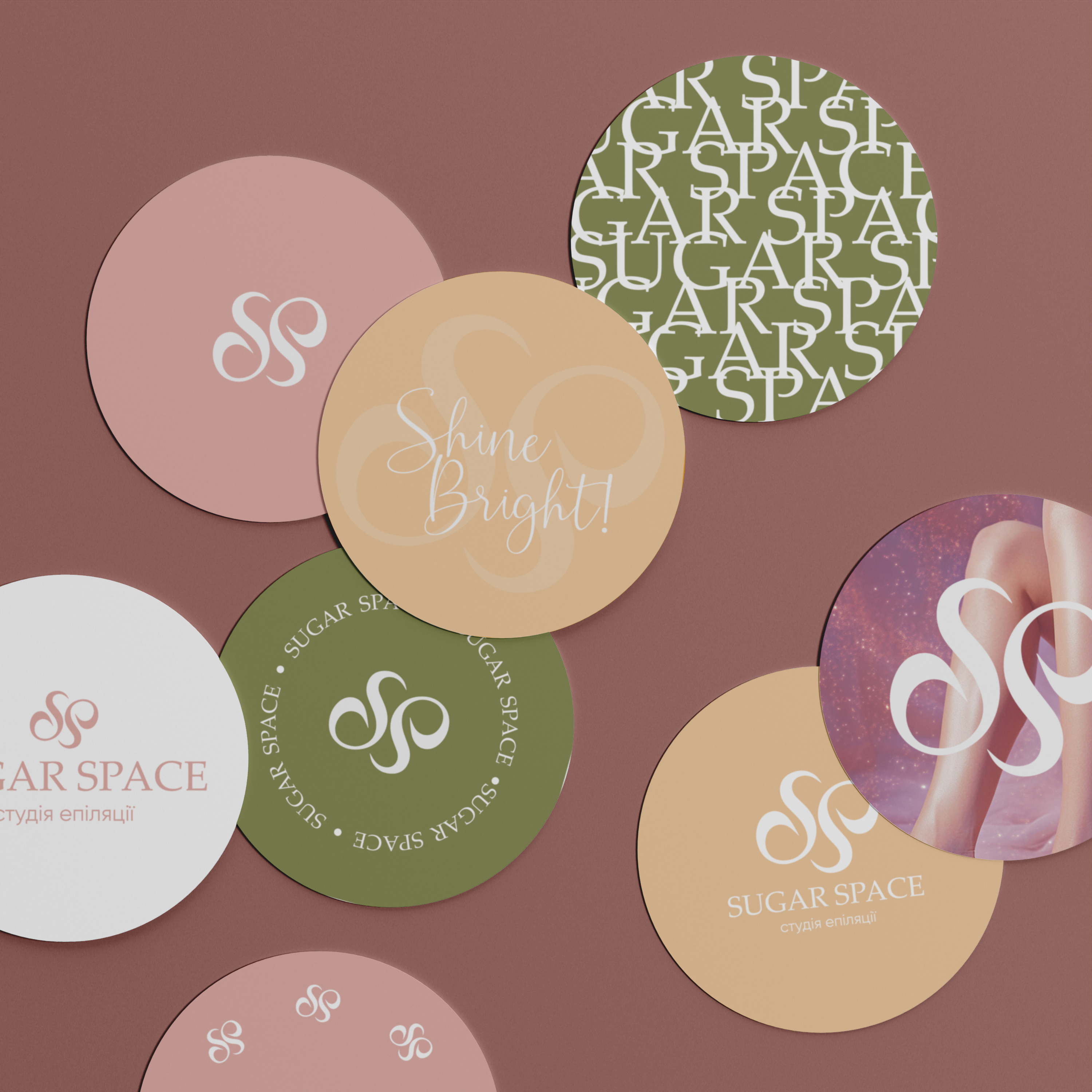
The idea for this project arose from the desire to give a new sound to a studio that primarily works with a female audience. The main association became the image of cotton candy - lightness, tenderness, and pleasant emotions. That is why a gentle pink shade appeared in the identity, symbolizing femininity and comfort.
The logo is based on the combination of two letters from the studio's name, forming a refined shape that emphasizes the elegance and harmony of the brand. A warm pastel palette has been chosen for the identity, supporting an atmosphere of coziness and balance.
To strengthen the connection between the studio and its clients, the following were developed: a minimalist and elegant business card, a client discount card that motivates for the next visit, a gift certificate for the studio's services, various sticker options for merchandise, a shopper, and an apron with the logo, all creating a unified aesthetic and style for the female space.