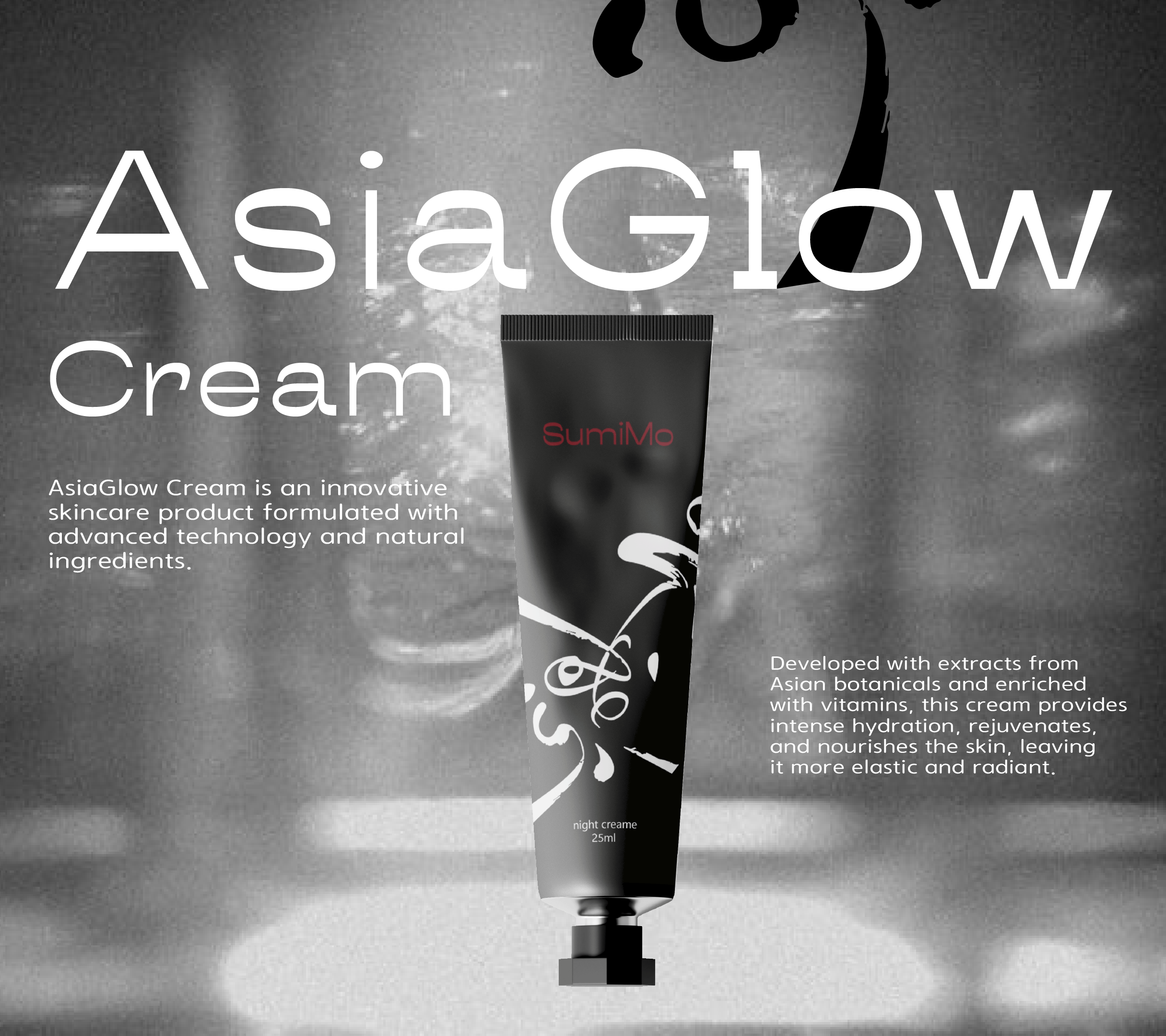
During the development of the packaging for the Korean cream in red and black light, I put all my creativity and professional skills. These colors - red and black, symbolize elegance, strength, and luxury, which is perfect for a premium product like Korean cream.
Every detail of the packaging was carefully crafted, starting from the choice of fonts, for which harmonious shades of red and black were selected, and ending with graphic elements that added elegance and prestige.
The red and black packaging creates an impression of luxury and carefully emphasizes the quality of the product. This design aims to attract the attention of consumers and become a memorable element of your Korean cosmetics brand.