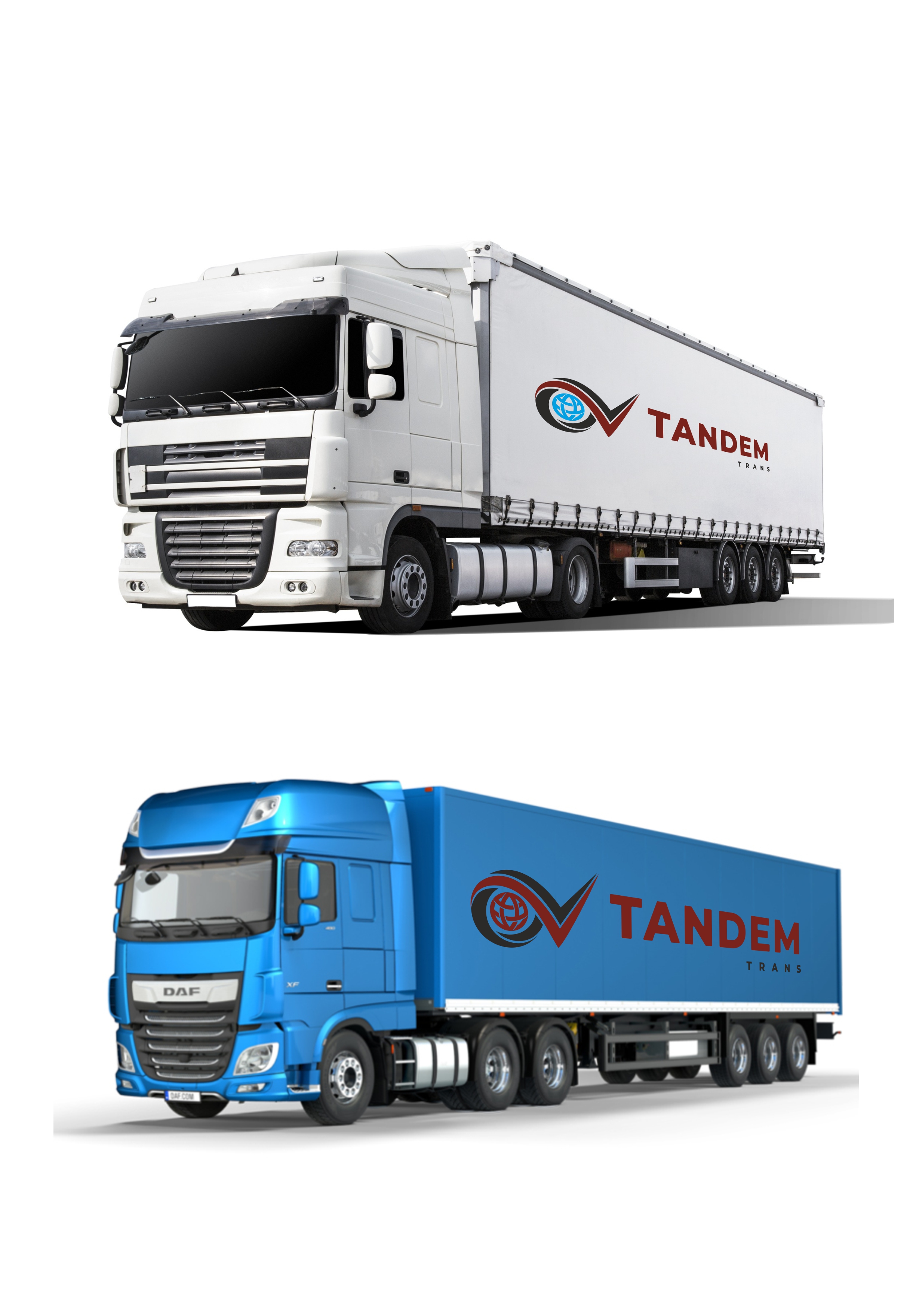
The logo is created according to the client's requirements and reflects the key principles of the company – globality, reliability, and dynamic development.
The basis of the logo is the initials of the co-owners – the letters "O" and "V", which have a special semantic meaning:
The letter "O" contains an icon of the planet Earth in blue color, symbolizing the international scale of operations, logistics without borders, and global connectivity.
The letter "V" is designed in the form of a check mark, which is associated with accuracy, responsibility, and fulfillment of obligations. The elongated line of this letter smoothly transitions into a stylized road, emphasizing the company's logistics direction and its dynamic development.
Immediately after this element is the name of the company TANDEM, which symbolizes partnership, coordinated work, and reliability in the field of international transportation.
#Logo #LogoDesign #TransportCompany #Logistics #InternationalTransportation #Transport #Branding #CustomLogo #LogisticsDesign #TransportCompanyLogo #GraphicDesign