The RedDotGames
Logo Design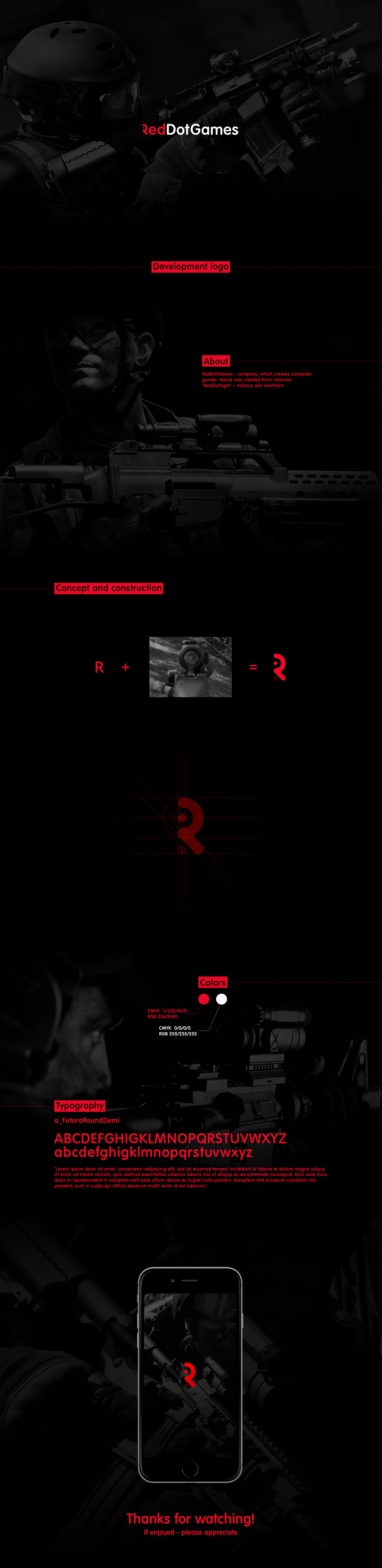
Development logo for RedDotGames
RedDotGames (company specializing in the development of computer games).
The name came from the informal name "RedDotSight" of the Army AimPoint. It represents itself (as strange) a red point and allows a person to confidently hit goals in any circumstances. (You could see it practically in all the military games of modernity) With the company this is linked from the point of view of two things: - first project - game related to military actions - minimalist, simple in dealing, but in the same time functional and complex inside, which corresponds to the approach of the company to work.
To solve this task, he decided to combine the element of the prequel (point) and the headline of the name of the company "R". As a result, out of the brief, a minimalist, font logo with the possibility of the use of the unified stylized letter "R" was obtained.
My customer and I are completely satisfied with the result.