This visual style is designed for the US market, where time is the most valuable resource. The logo reflects the transformation of the complex job search process into an instant action.
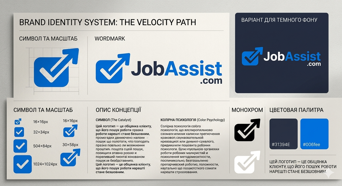
Symbol:
We have abandoned outdated metaphors. Instead, a dynamic geometric shape is used, combining a "tray" for resumes and an arrow-cursor. This is a visual response to the main function of the product: uploading in one motion and instant results. The shape of the arrow is angled upward at 45 degrees — an international symbol of growth and success.
Color psychology:
The use of deep #31394E adds weight and authority to the brand (like in Stripe), while the accent blue #006FEE symbolizes high technology and intelligence. This combination looks professional but not "cold."
Scalability:
The symbol is designed to remain perfectly clear even at a size of 16px (favicon). This is critically important for a SaaS platform, where the icon in browser bookmarks or on a smartphone screen is the main brand identifier.
The absence of unnecessary details in the Wordmark emphasizes the idea of the service: "We remove everything unnecessary, leaving only the result."