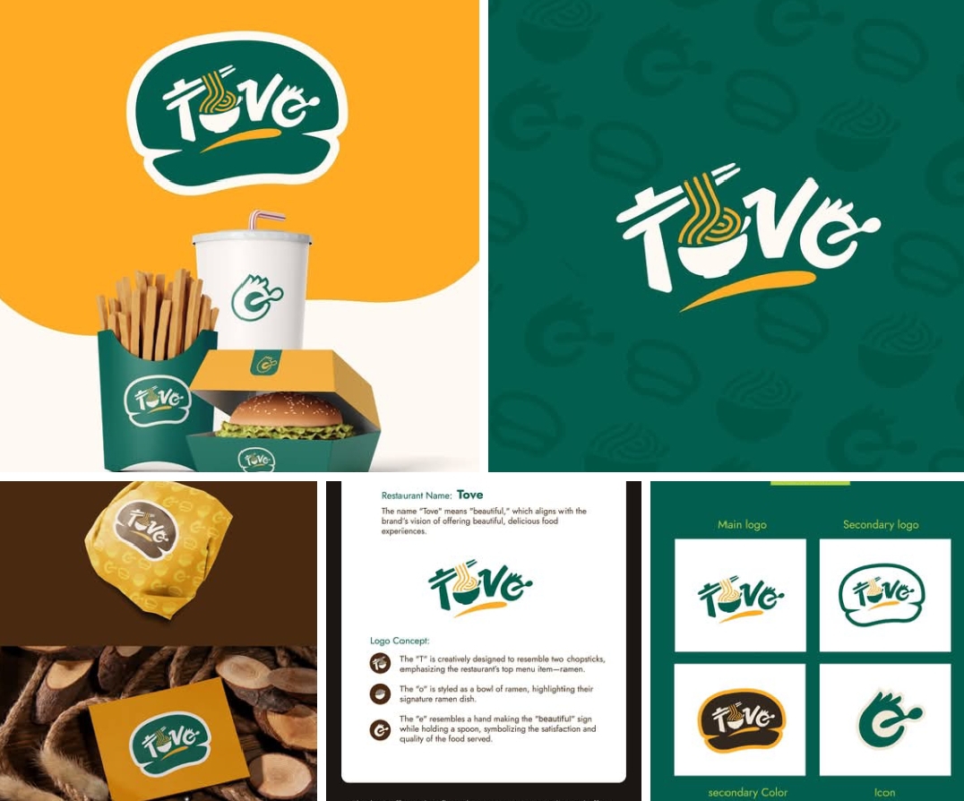
The brand Tove is built around the concept of beauty and deliciousness. The name "Tove" itself means "beautiful," aligning with the restaurant’s vision of serving aesthetically pleasing and mouthwatering dishes.
The logo design is packed with meaning:
The “T” is crafted to resemble chopsticks, emphasizing the restaurant's specialty – ramen.
The "O" is shaped like a bowl of ramen noodles, showcasing its signature dish.
The "V" takes the form of a hand making the "beautiful" sign, holding a spoon to represent quality and satisfaction.
The brand colors—deep green and warm yellow—create a visually rich and appetizing identity, making Tove stand out in the fast-food and ramen industry. The branding extends seamlessly across packaging, signage, uniforms, and digital platforms, ensuring a cohesive and modern look.
#ToveRestaurant #RamenLovers #FoodBranding #FastFoodDesign #CreativeLogo #MinimalistLogo #ModernBranding #AestheticFood #BrandIdentity #Foodie #FusionCuisine
The logo design is packed with meaning:
The “T” is crafted to resemble chopsticks, emphasizing the restaurant's specialty – ramen.
The "O" is shaped like a bowl of ramen noodles, showcasing its signature dish.
The "V" takes the form of a hand making the "beautiful" sign, holding a spoon to represent quality and satisfaction.
The brand colors—deep green and warm yellow—create a visually rich and appetizing identity, making Tove stand out in the fast-food and ramen industry. The branding extends seamlessly across packaging, signage, uniforms, and digital platforms, ensuring a cohesive and modern look.
#ToveRestaurant #RamenLovers #FoodBranding #FastFoodDesign #CreativeLogo #MinimalistLogo #ModernBranding #AestheticFood #BrandIdentity #Foodie #FusionCuisine