UI/UX DESIGN: Landing for the barbershop.
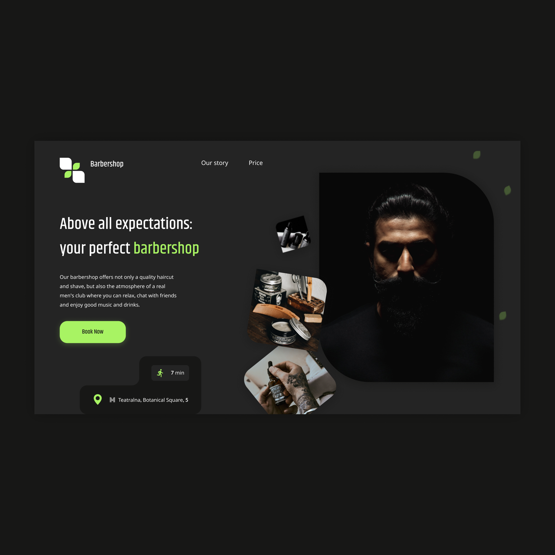
Hello to you!I'm glad to share with you my story about how I created a banding for a barbershop.At first I collected all the necessary content for the banding, such as photos, service descriptions and information about the barbershop itself.Then I decided to use the platform to create a banding like Figma.This allowed me to quickly create an attractive and modern Lending design.Then I decided which elements should contain my landing.Since barbershop is predominantly a visual business, I decided that bright elements and high-quality photographs should be first.I used the image of a stylish interior and quality products.Then I added information about the services that the barbershop provides, and their prices.In order for customers to have an idea of the barbershop itself, I decided to add a short description in a separate block.I also added a block with customer reviews to show the confidence and satisfaction of the previous barbershop customers.I decided it was important to have on the banding contact information of the barbershop, such as the address, the phone and the work hours.And of course, all of this is accompanied by a form of feedback.In general, creating a banding for a barber shop was quite simple and it took me only 2 days.
 Kyiv
Kyiv