UI/UX design portfolio for a developer: responsive, mobile-first
Interface Design (UI/UX)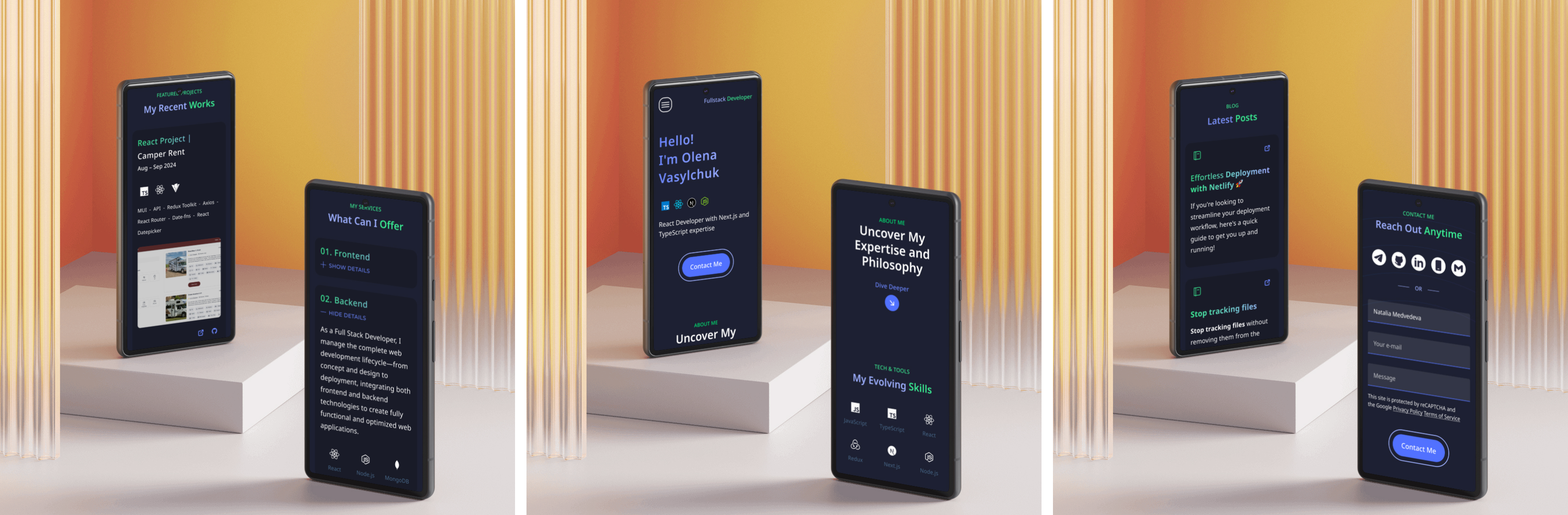
The task included:
- building a structure considering the typical structure of similar pages,
- visual zoning and alignment of blocks,
- adaptation for three breakpoints,
- selection of fonts and colors taking into account the client's preferences.
Work was done in Figma.
Focus - to help find your style. Clear, easy presentation of information.
The project covers three key breakpoints: mobile (320px), tablet (768px), and desktop (1440px).