Coffee packaging
Packaging and label design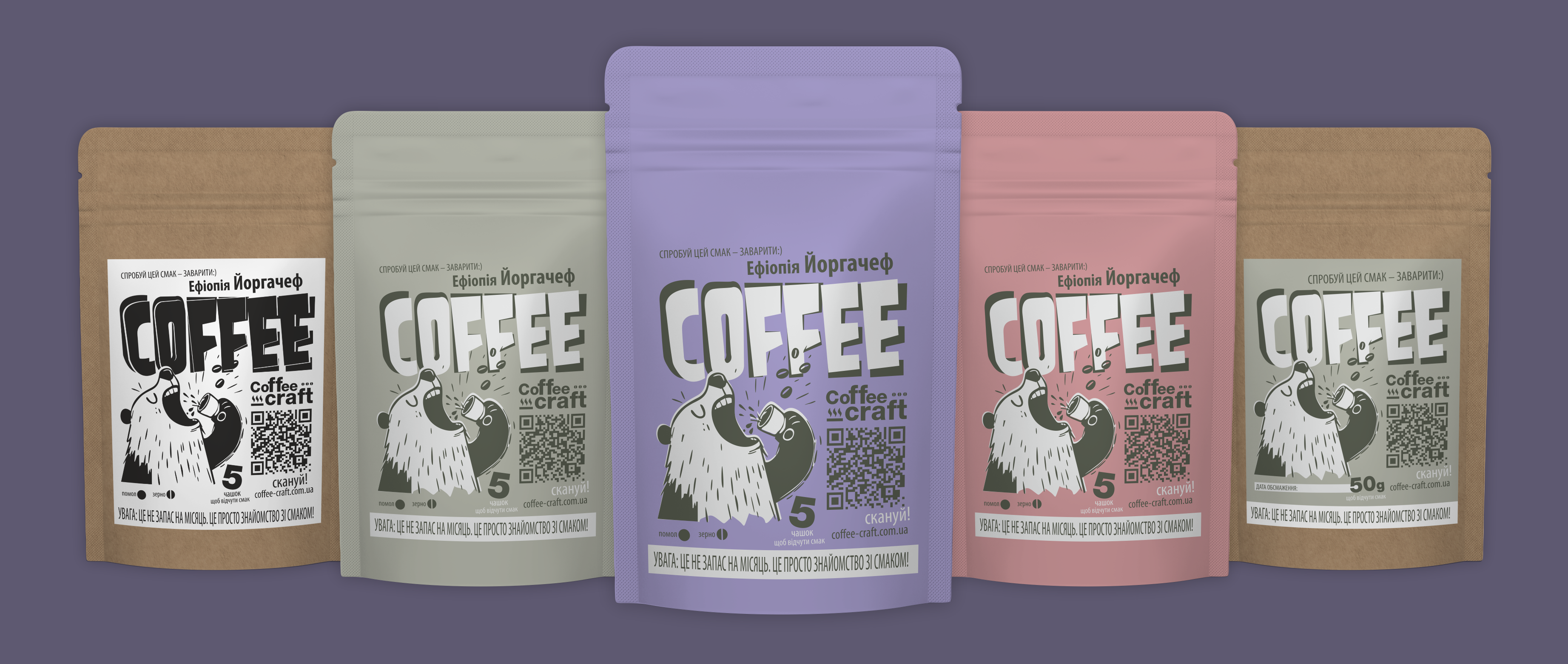
Coffee packaging that does not pretend to be "premium from Switzerland," but honestly states: here it will be strong, tasty, and without marketing hype.
The task was simple yet complex at the same time — to create a design that is recognizable from three meters away, does not require a translator from "branding," and is not afraid of bright colors.
Illustration — with character, typography — loud, colors — such that the coffee looks not like "another one from the shelf," but as a choice with mood. The packaging easily scales for different flavors, volumes, and color series, but does not lose its face (and character).
In short: coffee that screams "COFFEE," not whispers "artisanal feelings."
#coffeePackaging #packagingDesign #brandingDesign #graphicDesign #illustration
#packagingDesign #coffeeDesign #branding #graphicDesign #illustration
The task was simple yet complex at the same time — to create a design that is recognizable from three meters away, does not require a translator from "branding," and is not afraid of bright colors.
Illustration — with character, typography — loud, colors — such that the coffee looks not like "another one from the shelf," but as a choice with mood. The packaging easily scales for different flavors, volumes, and color series, but does not lose its face (and character).
In short: coffee that screams "COFFEE," not whispers "artisanal feelings."
#coffeePackaging #packagingDesign #brandingDesign #graphicDesign #illustration
#packagingDesign #coffeeDesign #branding #graphicDesign #illustration