Vegan Amigos is a comprehensive brand identity project designed for a modern, community-focused plant-based culinary venture. The visual language moves away from the typical "earthy and muted" vegan tropes, instead embracing a high-energy, colorful, and approachable aesthetic that celebrates the joy of food and friendship.
Brand Visuals & Core Elements
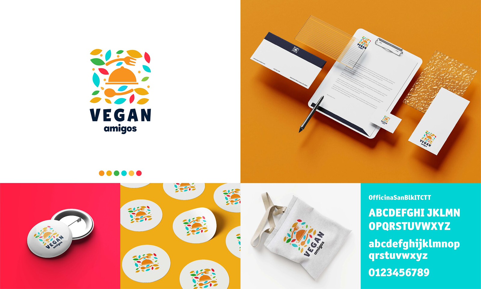
The Logo: A playful and sophisticated emblem featuring a cloche (food cover) and cutlery silhouettes nestled within a burst of colorful, leaf-shaped accents. The imagery symbolizes fresh ingredients and "ready-to-serve" hospitality.
Color Palette: A curated selection of "flavor-rich" colors including Zesty Orange, Watermelon Red, Leaf Green, and Teal, balanced by a deep Navy for professional weight and readability.
Typography: The brand utilizes the OfficinaSanBlkITCTT typeface—a bold, rounded sans-serif that feels both sturdy and friendly. The mix of uppercase for "VEGAN" and lowercase for "amigos" emphasizes the brand's balance between professional quality and casual warmth.
Collateral & Application
The identity is designed for maximum versatility across multiple physical touchpoints:
Stationery Suite: Clean, professional business cards, letterheads, and envelopes that use white space to let the colorful logo pop.
Merchandise & Packaging: Sustainable applications including branded tote bags, stickers for eco-friendly packaging, and pin-back buttons for staff or community events.
Pattern Play: The leaf and cutlery elements are designed to be deconstructed into vibrant patterns, perfect for interior decor or digital backgrounds.
Brand Visuals & Core Elements
The Logo: A playful and sophisticated emblem featuring a cloche (food cover) and cutlery silhouettes nestled within a burst of colorful, leaf-shaped accents. The imagery symbolizes fresh ingredients and "ready-to-serve" hospitality.
Color Palette: A curated selection of "flavor-rich" colors including Zesty Orange, Watermelon Red, Leaf Green, and Teal, balanced by a deep Navy for professional weight and readability.
Typography: The brand utilizes the OfficinaSanBlkITCTT typeface—a bold, rounded sans-serif that feels both sturdy and friendly. The mix of uppercase for "VEGAN" and lowercase for "amigos" emphasizes the brand's balance between professional quality and casual warmth.
Collateral & Application
The identity is designed for maximum versatility across multiple physical touchpoints:
Stationery Suite: Clean, professional business cards, letterheads, and envelopes that use white space to let the colorful logo pop.
Merchandise & Packaging: Sustainable applications including branded tote bags, stickers for eco-friendly packaging, and pin-back buttons for staff or community events.
Pattern Play: The leaf and cutlery elements are designed to be deconstructed into vibrant patterns, perfect for interior decor or digital backgrounds.