VELME— conceptual design of brand and packaging for cosmetics
Packaging and label design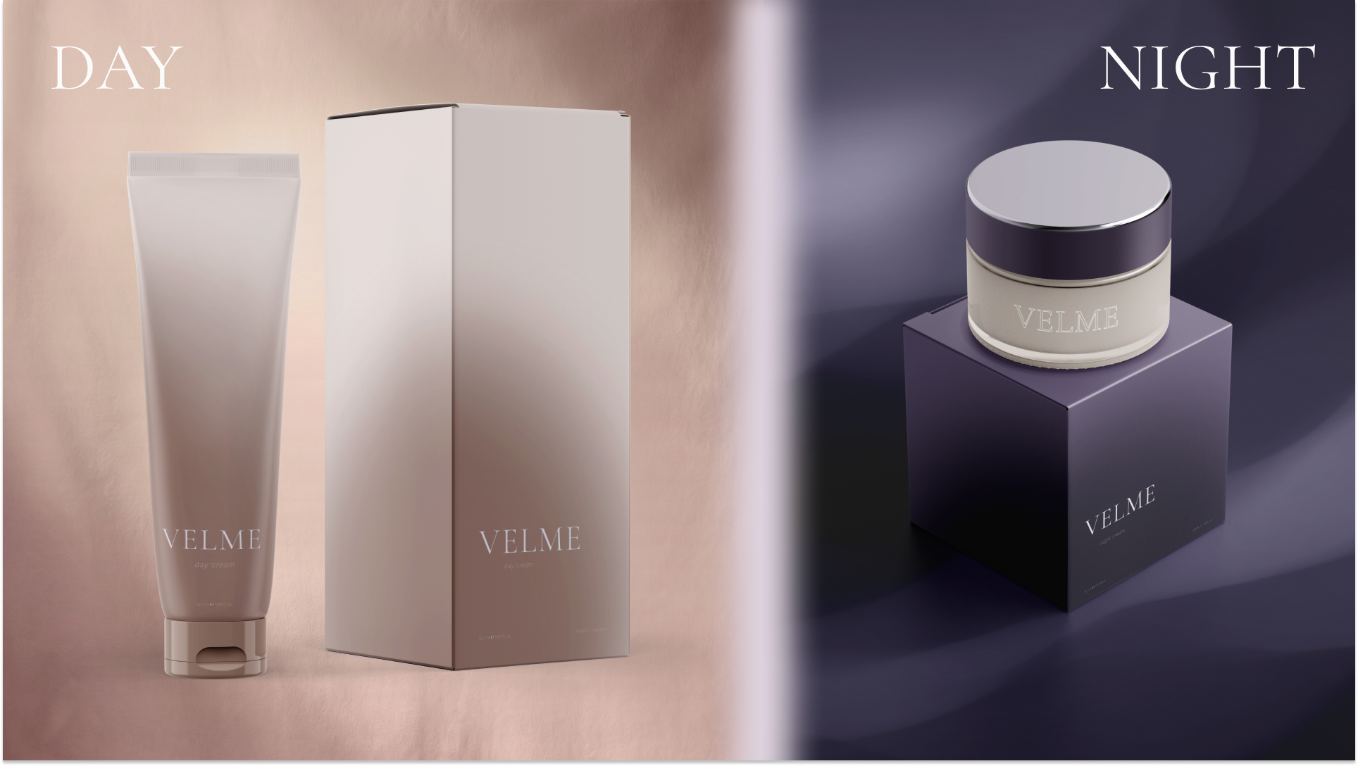
VELME is an intimate skincare brand for women aged 22–35, built around the idea of quiet personal moments, tenderness, and tranquility. The brand's visual language does not shout; it conveys presence, warmth, and lightness, rejecting unnecessary pomp.
Design solutions and product markers:
1. Color as a time of day. The identity of the Day & Night cream line is based on a gradient that conveys a smooth transition of light. The day cream (Day) features a warm pink-beige undertone associated with morning awakening. The night cream (Night) has a smoky purple-gray tone that conveys the depth of evening time.
2. Functional distribution of forms. The design takes into account the consumer's pace of life and rituals. The day cream is presented in a dynamic, hygienic tube for quick application, while the night cream is in a glass jar, setting the mood for a slow, evening care routine.
3. Tactile experience and details. The brand interacts with the audience through thoughtful little things: a minimalist safety seal and a Thank You Card, which serves as an emotional personal address to the individual, emphasizing the slogan: "care does not choose time."
As a result, I created a cohesive, visually consistent brand ecosystem where the packaging is an extension of the product, and the design works on the level of sensations and the daily rituals of the customer.
#packaging_design #packaging #identity #branding
Design solutions and product markers:
1. Color as a time of day. The identity of the Day & Night cream line is based on a gradient that conveys a smooth transition of light. The day cream (Day) features a warm pink-beige undertone associated with morning awakening. The night cream (Night) has a smoky purple-gray tone that conveys the depth of evening time.
2. Functional distribution of forms. The design takes into account the consumer's pace of life and rituals. The day cream is presented in a dynamic, hygienic tube for quick application, while the night cream is in a glass jar, setting the mood for a slow, evening care routine.
3. Tactile experience and details. The brand interacts with the audience through thoughtful little things: a minimalist safety seal and a Thank You Card, which serves as an emotional personal address to the individual, emphasizing the slogan: "care does not choose time."
As a result, I created a cohesive, visually consistent brand ecosystem where the packaging is an extension of the product, and the design works on the level of sensations and the daily rituals of the customer.
#packaging_design #packaging #identity #branding