Visitors for the massage office
Business Card Design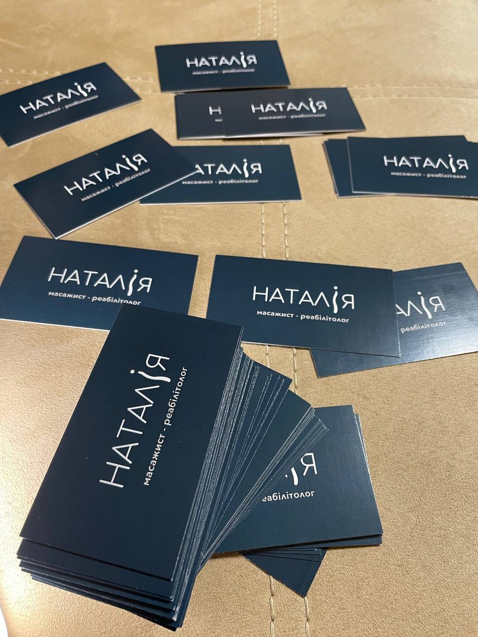
The task was to develop a laconic visit card for the massage office. The client was missing a logo and a branded identity. I was asked to simply write the name, office and contacts.
I was asked to add creativity and awareness to the name on the front side of the visit card. I developed the letter "and" in the form of a human back. Also on the reverse part was added a secondary color, which in touch with the main color formed a silhouette of the human back.
I was asked to add creativity and awareness to the name on the front side of the visit card. I developed the letter "and" in the form of a human back. Also on the reverse part was added a secondary color, which in touch with the main color formed a silhouette of the human back.