The identity for Tatiana Velyka was created for a massage therapist who specializes in relaxation, therapeutic, and aesthetic massages. The project's task was to develop a gentle, calm, and at the same time professional visual system that conveys an atmosphere of care, warmth, and trust.
The key idea was the combination of naturalness and softness: the color palette used pastel pinks, creams, and neutral shades that are associated with calmness and corporeality. The logo and graphic elements are built on smooth lines and shapes that symbolize the movement of hands, the lightness of touch, and a harmonious energy flow during the massage.
The design includes:
logo and its variations
brand palette and font system
business cards in a gentle minimalist style
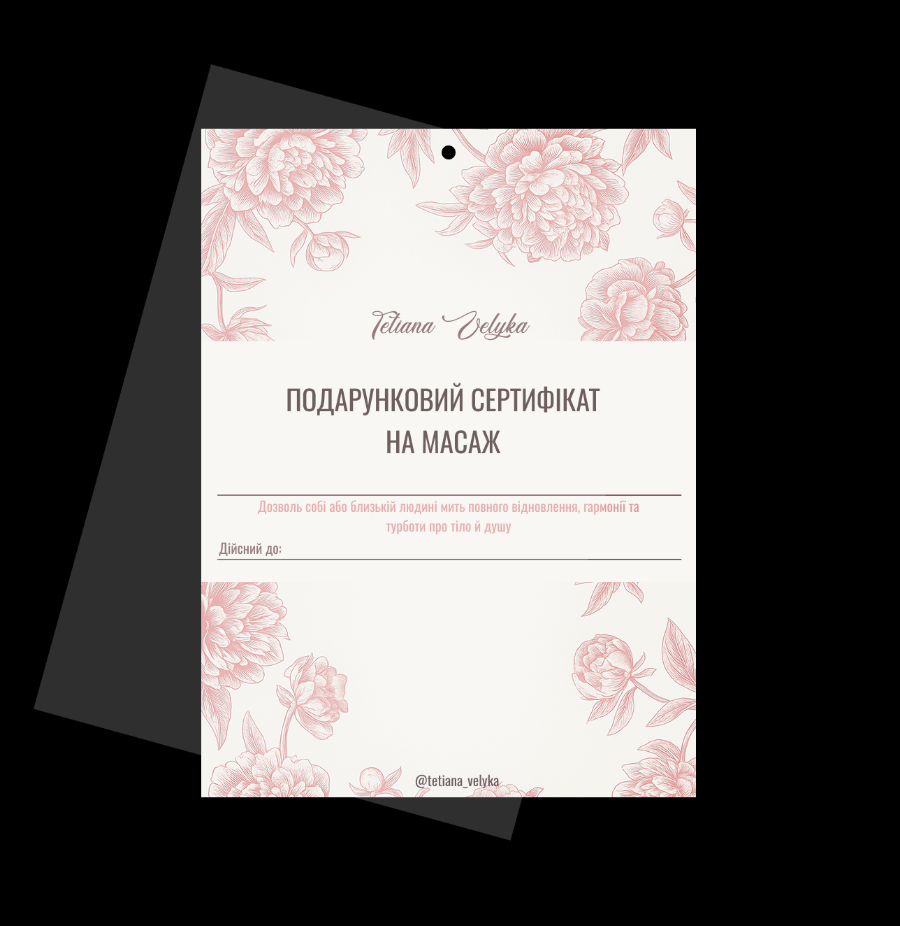
gift certificate
compositional layouts for social media
basic system of graphic elements
The key idea was the combination of naturalness and softness: the color palette used pastel pinks, creams, and neutral shades that are associated with calmness and corporeality. The logo and graphic elements are built on smooth lines and shapes that symbolize the movement of hands, the lightness of touch, and a harmonious energy flow during the massage.
The design includes:
logo and its variations
brand palette and font system
business cards in a gentle minimalist style
gift certificate
compositional layouts for social media
basic system of graphic elements