Project: creation of web banners for children's dentistry for Instagram.
This series of creatives is designed for medical and service brands with a focus on trust, clarity, and quick reading of the offer. The main task is to relieve the client's tension and clearly convey the value of the service from the first contact.
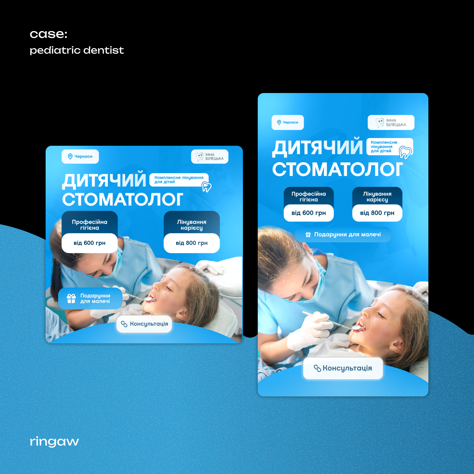
Visually, the creatives are built on a combination of live photos of the process, a large readable headline, and structured informational blocks. The design is not overloaded — attention is directed to the service, the specialist, and key advantages.
Key highlights:
Trust and safety — real photos of the doctor and child, soft color palette, associations with calmness and professionalism.
Clear presentation of services — clearly highlighted treatment areas with prices, without small text and "water".
Structure and hierarchy — headline → benefits → price → CTA, allowing for quick understanding of the meaning even in an advertising feed.
Human communication — emphasis on caring for the child, rather than aggressive selling.
Adaptability — the design easily scales to different formats: Instagram, Facebook, Stories, advertising banners.
The creatives are focused on practical results: increasing trust, clear positioning of the service, and motivation for the first contact (consultation).
#creatives #advertising #InstagramAds #FacebookAds #targeting
This series of creatives is designed for medical and service brands with a focus on trust, clarity, and quick reading of the offer. The main task is to relieve the client's tension and clearly convey the value of the service from the first contact.
Visually, the creatives are built on a combination of live photos of the process, a large readable headline, and structured informational blocks. The design is not overloaded — attention is directed to the service, the specialist, and key advantages.
Key highlights:
Trust and safety — real photos of the doctor and child, soft color palette, associations with calmness and professionalism.
Clear presentation of services — clearly highlighted treatment areas with prices, without small text and "water".
Structure and hierarchy — headline → benefits → price → CTA, allowing for quick understanding of the meaning even in an advertising feed.
Human communication — emphasis on caring for the child, rather than aggressive selling.
Adaptability — the design easily scales to different formats: Instagram, Facebook, Stories, advertising banners.
The creatives are focused on practical results: increasing trust, clear positioning of the service, and motivation for the first contact (consultation).
#creatives #advertising #InstagramAds #FacebookAds #targeting