Website Structure:
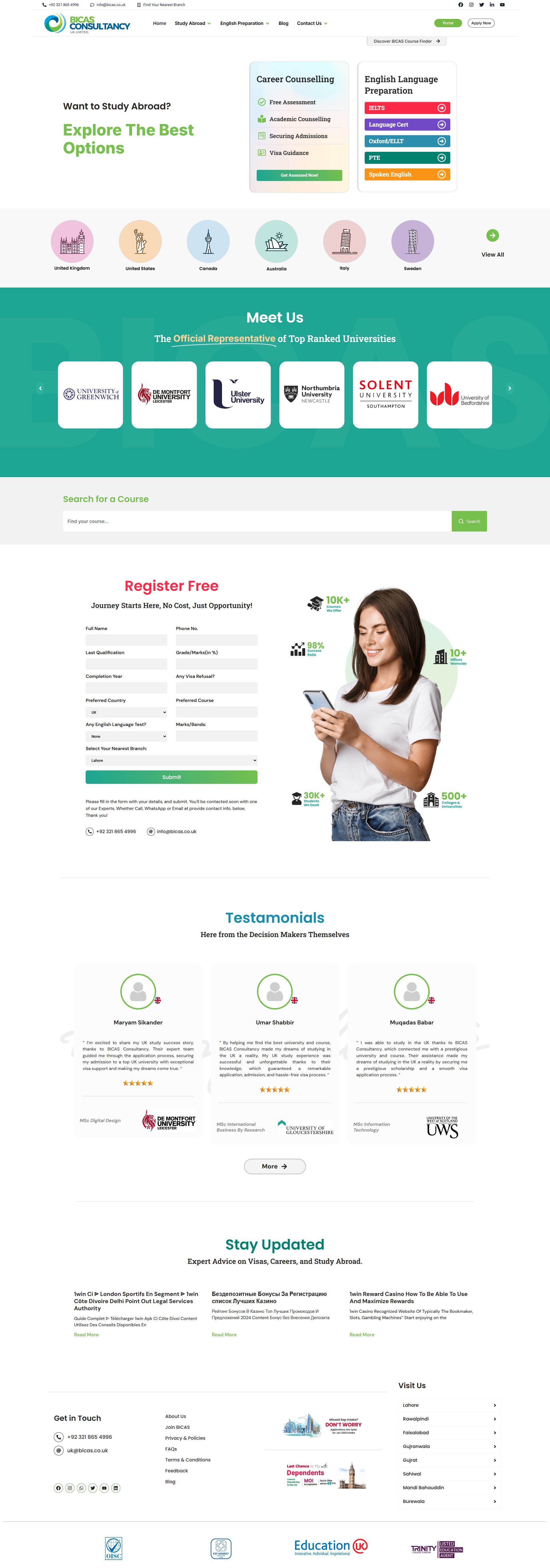
1. Main Screen (Hero Section):
• Central banner with the headline "Want to Study Abroad? Explore The Best Options".
• Two main CTA blocks:
• "Get Assessed Now" (consultation).
• "IELTS, Language Cert, Oxford/IELTS, PTE" (exam preparation).
2. Country Section:
• List of countries for study (United Kingdom, USA, Canada, Australia, Italy, Sweden, etc.).
• Carousel or scroll for country selection.
3. "Meet Us" Section:
• Logos of well-known partner universities.
• Representation of trust through brands.
4. Course Search:
• Field for quick program search by keywords.
5. Registration Form:
• "Register Free" block with a detailed questionnaire (name, phone number, education level, etc.).
• Call to action — "Submit".
6. Testimonials:
• Client testimonials with photos, text, and names of the universities they enrolled in.
7. Blog/Updates:
• Articles on visas, career advice, and studying abroad.
8. Footer:
• Contacts, list of offices in different cities.
• Privacy policy, FAQ, links to social media.
Key Elements:
1. Number of Blocks:
• Main informational blocks: 8.
• Additional sections: footer, search, partner logos.
2. CTA (Call to Action):
• Main calls: "Get Assessed Now" and "Submit" in the registration form.
• Secondary CTAs — links to exam preparation and blog.
3. Animation:
• Likely basic animation used for CTA buttons, country carousel, and university logos.
• Possible hover effects.
4. Layout:
• The site is designed in a mobile-first style, optimized for mobile devices.
• Logical grouping of elements ensuring ease of navigation.
• Use of modern design with an emphasis on a color palette associated with trust (green, blue).