Website design for English language courses
Web Design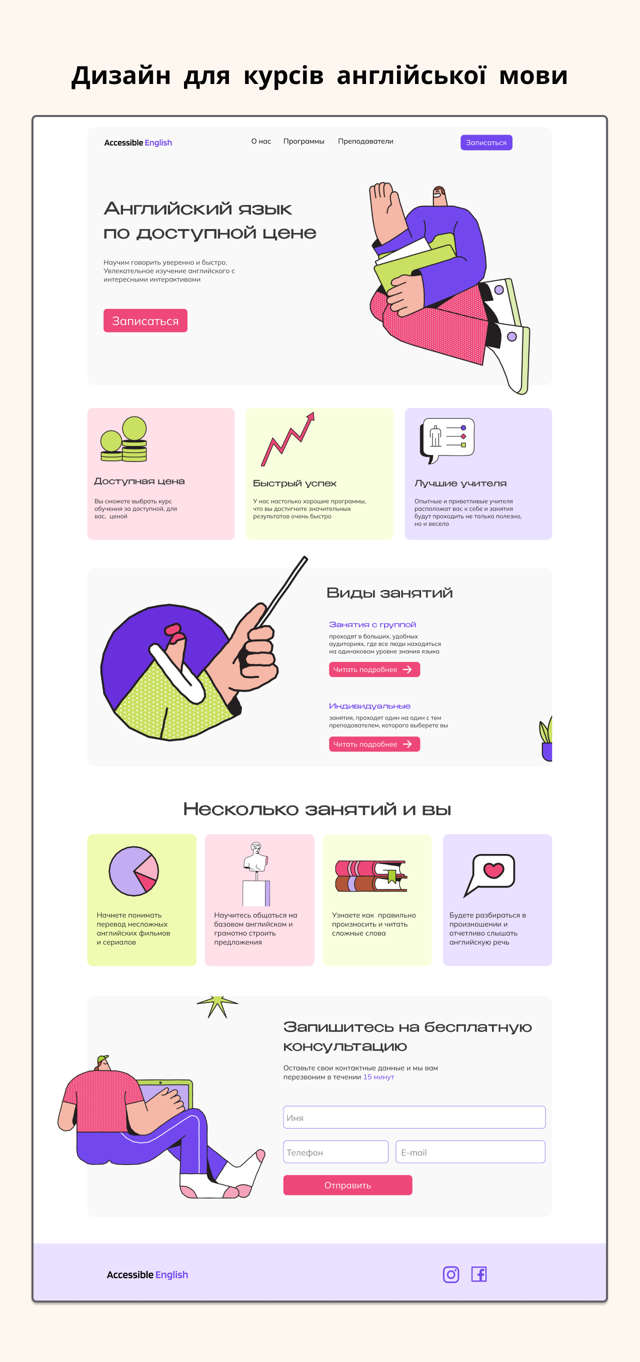
Design of the main page of the website for English language courses
Niche/Type of project:
An online platform for English language online courses. The main page is designed so that visitors immediately understand which courses are available, the benefits of learning, and how to sign up quickly.
Task:
Create a modern and functional design for the main page of the online English school that:
demonstrates the key benefits of learning,
encourages users to register for a course,
provides easy navigation on the platform,
is suitable for both beginners and advanced students.
Tools and technologies:
The layout is created in Figma, using UI/UX design principles, prototyping, and responsive design for mobile and desktop versions.
My solutions:
Thoughtful structure of the main page: blocks with benefits, popular courses, student testimonials, buttons with a clear call to action (“Sign up for a course”).
All banners and graphic materials were selected and created by me, including icons, illustrations, and promotional images.
A bright and modern style was used: clean space, contrasting colors for important elements, large and readable typography.
Responsive design ensures comfortable use on any device.
Result:
The finished layout of the main page for the online English school looks professional, attracts potential students, and encourages action. The design can be easily implemented on any online course platform (Tilda, WordPress, LearnDash, etc.).