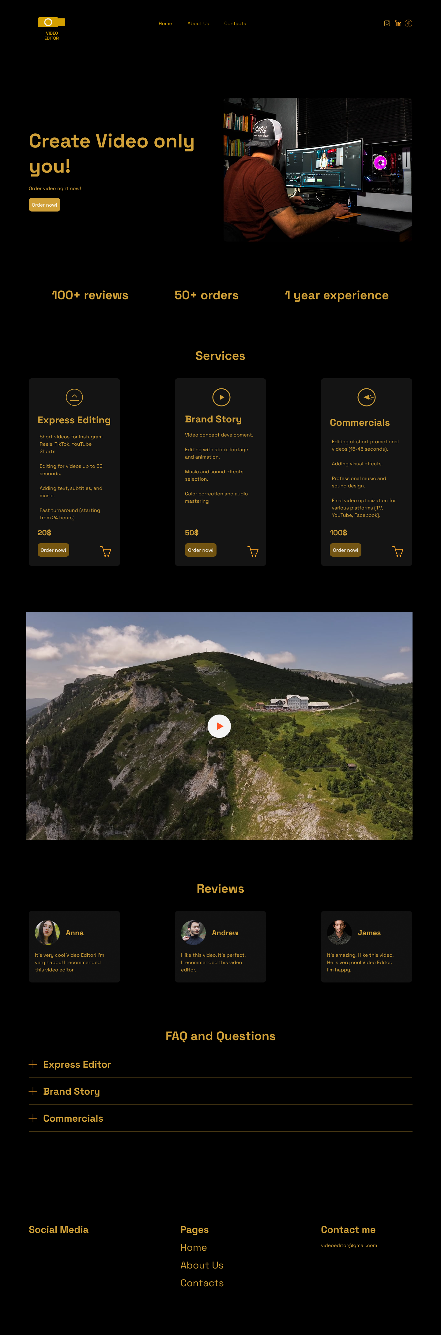
The website design is created with consideration of the professional specifics of video editing, which combines technicality, creativity, and visual aesthetics. The main goal is to emphasize expertise, attention to detail, and the artistic vision of the video editor.
The purpose of the site is to present video editing services in a professional and stylish format to attract new clients, demonstrate the level of mastery through a portfolio, and provide a convenient way to communicate.
Thanks to the adaptive design, the site looks impressive on both mobile devices and computers, allowing users to conveniently view my work anywhere. The chosen color scheme — a black background with golden accents — creates a premium visual atmosphere that highlights the quality and style of my videos.
Color scheme
Background: Rich black
Text and interface elements: Shades of gold
The black background is chosen not only for its modern, restrained appearance but also for its association with the professional video industry — black is the standard background color in many video editors and studios. It helps focus the user's attention on the content and gives the design depth and contrast.
Golden shades in the text and interface elements symbolize premium quality, craftsmanship, and a high level of service. They create associations with awards, achievements, and aesthetic refinement, which is important for a creative professional showcasing their portfolio.
Visual hierarchy and accents
Gold is used for headings, icons, buttons, and interactive elements, making it easy to navigate the page. It also helps highlight key sections — for example, work samples, client testimonials, or contact information.
Overall atmosphere
The site creates a cinematic feel — like a trailer presenting the video editor's portfolio. The combination of black and gold conveys a sense of exclusivity and visual drama, which is perfect for the video production field.