I developed a website for the fitness equipment brand TM Impuls, aimed at gym owners and the professional fitness segment. The main idea was to convey a sense of strength, technology, and a modern approach to training.
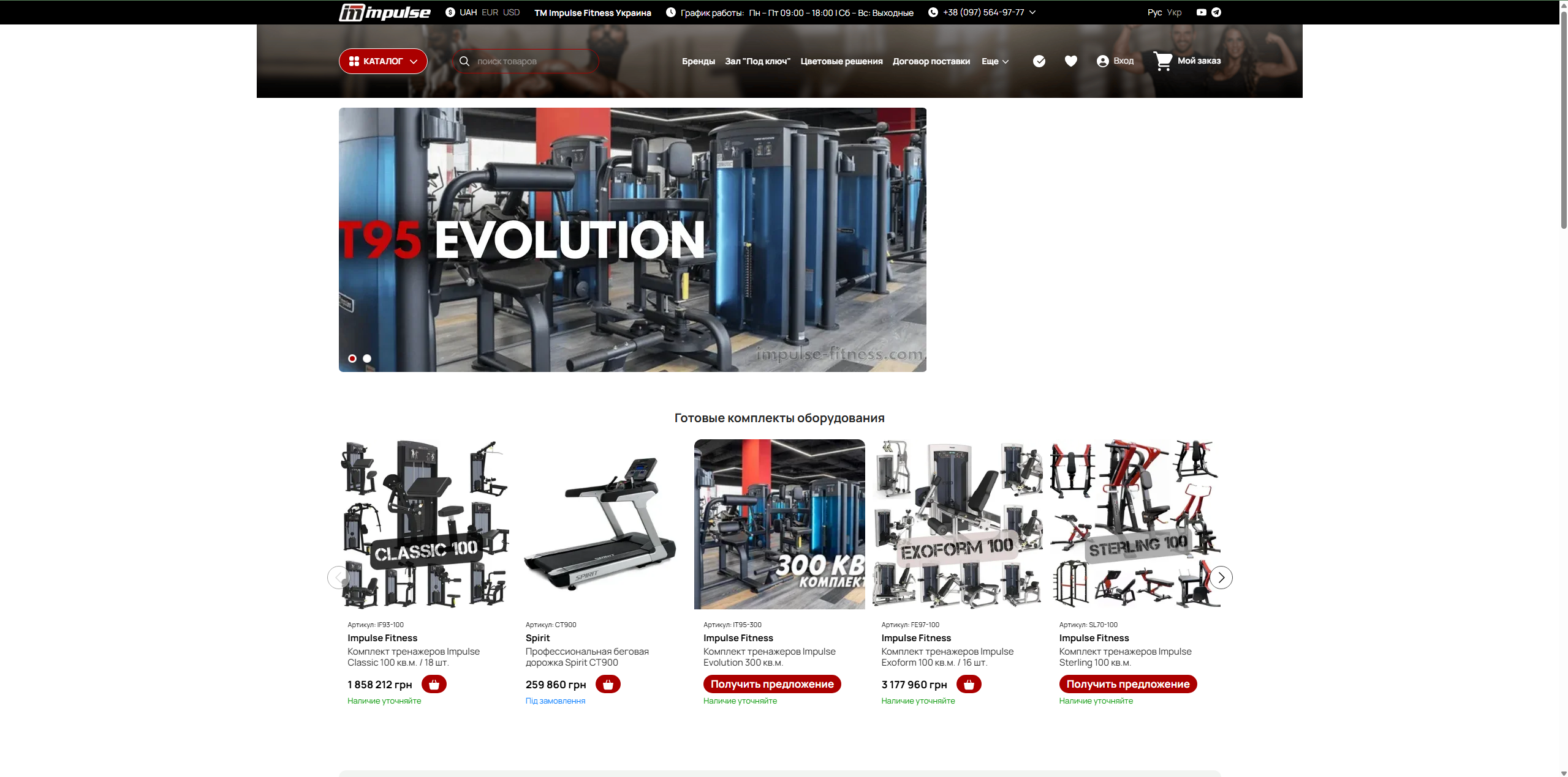
On the main screen, I focused on visuals — using dynamic photos and videos of workouts to immediately create a "wow effect" and show that this is not just equipment, but a full-fledged part of a strong brand. I added a clear headline and call-to-action buttons so that users could immediately navigate to the catalog or leave a request.
I made the website structure as simple and logical as possible. There is a main page with brief information about the brand, sections with advantages and case studies, as well as a separate catalog page. In the catalog, users can conveniently browse the equipment, filter it, and open detailed cards with specifications.
In the design, I used a dark color scheme with bright accents to emphasize the sporty character of the brand. I added elements that are associated with the gym — metal, contrasting light, dynamics. This helps create an atmosphere of strength and energy.
I also took care of convenience: the website is fully responsive, works well on phones, and loads quickly. I added basic SEO optimization and analytics so that the site could be promoted and user behavior could be tracked.
As a result, it turned out to be a modern, clear, and visually strong website that not only showcases the products but also builds trust in the brand and encourages users to leave a request or contact the company.